Nature Photographers Network
This is the preserved archive of the original Nature Photographers Network. The community continues at naturephotographers.network.
Already miss it
‹ PreviousLandscape GalleryNext ›

Already miss it

by Russell Colletta

Gallery: LandscapePosted November 14, 2012166 views10 comments
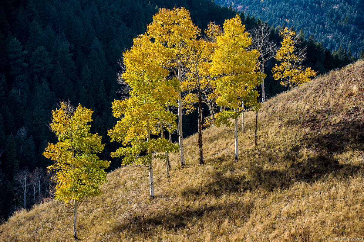
Fall is spectacular in Colorado but it just doesn't last very long. I'm still exploring and trying to know where to be when because chances for the ill informed and uninitiated are fleeting. This is a little slice of fall near Westcliffe, Colorado. I really liked the diagonals and the way the light made these trees come alive, right before they go to sleep for the winter. And it all happens way too fast.

Nikon D600, 70-200 f2.8 Nikkor @f5.6, 1/100 @ISO 100 on a tripod.

Comments

10 comments
Comment posted by Nancy Lea Sandy on November 15, 2012 at 10:23 AM
The light is wonderful and I agree with your take on the diagonals. I rather like the way the image is separated into distinct temperature zones.
Registered on January 24, 2011, 576 Posts, 6942 Comments
Comment posted by Morris McClung on November 15, 2012 at 10:44 AM
I know exactly how you feel. All too brief in it's glory. And, it is my favorite time of year here in Colorado, for obvious reasons. It's like a long 4th of July show with oohs, and ahhs around every curve of highway or trail.

Love the triad of triangles in your comp with the bright aspen exploding along the ridge. Very well done!
Registered on May 7, 2007, 670 Posts, 19650 Comments
Comment posted by Russell Colletta on November 15, 2012 at 11:03 AM
Thanks Morris and Nancy. Here's the same image without any crop. The original post was slightly cropped to get rid of some negative space in the lower right corner, but that may be splitting hairs. Is there any significant difference in your opinion? Just curious. Something else I like about this image is the detail in the dark background.
Registered on October 31, 2009, 114 Posts, 1008 Comments
Comment posted by Peter Richter on November 15, 2012 at 12:12 PM
Very appealing composition for me, Russell. I like the diagonals and verticals together with the interplay of light and shadow as well as complementing colors.

In the second version you allow the scene to breath freely at the right, what makes for a very nice feel to me. No empty space for me so far, yet full of textures.

Peter
Registered on November 10, 2010, 218 Posts, 2723 Comments
Comment posted by John&Patty Benway on November 15, 2012 at 12:53 PM
Russell, I definitely like your second post, the warm colors and cool background are very appealing. Beautifully seen and presented.
John
Registered on May 12, 2006, 626 Posts, 8700 Comments
Comment posted by Harley Goldman on November 15, 2012 at 6:06 PM
The light dark contrast is excellent. I like the second post better.
Registered on November 19, 2003, 586 Posts, 11271 Comments
Comment posted by Rudy Ruberti on November 15, 2012 at 6:52 PM
The trees really stand out nicely against the dark background and the additional room on the bottom of the repost works better for me. Great lines, too.
Registered on October 28, 2008, 179 Posts, 1875 Comments
Comment posted by Daniel Rappaport on November 15, 2012 at 10:28 PM
Wonderful light, beautifully composed and processed
Registered on September 9, 2009, 294 Posts, 2006 Comments
Comment posted by Lon Overacker on November 16, 2012 at 12:29 PM
Russell,

This is wonderful for at least two reasons. I love the contrasts here between the vibrant fall color and the shadows - both the bg ridge, and the tree shadows on the ground - cool. Also, as already mentioned, the lines and diagonals are very strong and make this a bit of a graphic image as well. Excellent combination.

The only small wish I have is a touch more breathing room both at the bottom and up top. Not a big deal though.

Well done.

Lon
Registered on November 24, 2006, 521 Posts, 19147 Comments
Comment posted by Tony Kuyper on November 16, 2012 at 10:22 PM
Really like the comp with the different tonal levels and the strong diagonal. Feels a bit tight at the top but realize this may be out of necessity. The contrast looks right, but also a bit strong. Just wondering if pulling the lights down a bit would make it seem less harsh.
Registered on November 1, 2003, 364 Posts, 22328 Comments