Nature Photographers Network
This is the preserved archive of the original Nature Photographers Network. The community continues at naturephotographers.network.
moon halo +rep#2
‹ PreviousLandscape GalleryNext ›

moon halo +rep#2

by Rob Graham

Gallery: LandscapePosted December 27, 20121,058 views16 comments
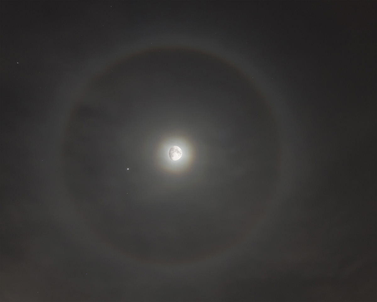
I captured this moon dog on Christmas Eve, from a front yard in the middle of town. I didn't have time to get away from town. This was my first attempt to photograph a moon dog. After shooting the moon dog with a wide angle lens, I put on a longer lens to capture the moon. In processing, I resized the moon photo to blend into the blown out moon of the moon dog image. Did I blend it in well enough? Does it look to out of place? 7D, ISO 400, f/5, 13 sec, 10mm with small crop; 300mm for moon image.

Comments

16 comments
Comment posted by Rob Graham on December 27, 2012 at 11:03 PM
Here is the same image without the detailed moon. Which do you prefer? Thank you.
Registered on August 22, 2006, 842 Posts, 2824 Comments
Comment posted by John Mumaw on December 27, 2012 at 11:41 PM
I prefer the second moon. Looks much more real to my eye. You might consider cropping the right side to make it more even with the left, aiding the symmetry present.
Registered on September 9, 2005, 62 Posts, 2289 Comments
Comment posted by Scott Fricke on December 27, 2012 at 11:49 PM
I prefer the second one. To me the moon in the first one doesn't quite look right. I think that is because with a near full moon like this you usually can see the outline of the 'dark' part of the moon and you can't here, although that may be due to the thin cloud layer in front of the moon.
Registered on January 19, 2007, 133 Posts, 1448 Comments
Comment posted by Youssef Ismail on December 28, 2012 at 12:16 AM
I prefer the second one as well Rob, but only because the brightness of the moon in the first is to low and the moon size is too big. The bright moon in the second appears to be the correct size. Resize the moon to that size and maybe blend it into the bright spot rather than replacing it completely.
Registered on November 1, 2003, 474 Posts, 5555 Comments
Comment posted by Daniel Rappaport on December 28, 2012 at 12:51 AM
Cool image but have to say that the impossibility of it makes it a bit hard to enjoy. The original (2nd image) is excellent.
Registered on September 9, 2009, 294 Posts, 2006 Comments
Comment posted by John Clulow on December 28, 2012 at 7:46 AM
I also prefer the second one; more natural in appearance. Nice shot and refractive color separation. I like the inclusion of the planets. I've been noticing them driving to work early in the morning.
Registered on November 1, 2012, 155 Posts, 1079 Comments
Comment posted by Mark Seaver on December 28, 2012 at 11:20 AM
Neat capture, Rob. Given what I see here, I too prefer the second post for it's better realism. However, I wonder if reducing the opacity of the blending in the first post would improve the realism. At the risk of sounding pedantic, I think what you've recorded so nicely here is the 22 degree halo. Moon dogs/sun dogs appear where this halo crosses the horizontal with the moon/sun. There's a fine web site that talks about all of the atmospheric optical phenomena with the ice halos shown here.
Registered on January 23, 2011, 1103 Posts, 17270 Comments
Comment posted by Stan Rose on December 28, 2012 at 12:14 PM
Yes, Mark is correct--no dogs here but a nice halo! Id keep it blown as in #2. :wavey:
Registered on September 15, 2005, 836 Posts, 17099 Comments
Comment posted by R.Bill Moser on December 28, 2012 at 12:28 PM
I love the details in the first one - but the second one is more realstic and so I tend to the second version.
Registered on January 29, 2010, 285 Posts, 4281 Comments
Comment posted by Rob Graham on December 28, 2012 at 1:27 PM
Thanks for all of the comments and info. I did some more research on moon dogs, and now understand why this is only a moon halo. I struggled with the moon in the original image, and agree that the blown out version is better.
Registered on August 22, 2006, 842 Posts, 2824 Comments
Comment posted by Lon Overacker on December 28, 2012 at 4:04 PM
Rob,

I think the potential here is excellent. I love the capture of the halo and the inclusion of the planet and stars adds a nice touch. I would agree with others that the first post is a bit PS'd - ie. unrealistic; not so much the size for me, just that I would expect the moon to look so good in a situation like this. However, I think the second image has a different problem in that the center/moon is just gray? I like Mark's idea of an opacity adjustment of the blend in the first; something easy to play around with, reducing the cut-n-pasted look of the first by reducing the opacity (masking too if needed) to leave some detail in the moon surface, but not so much it doesn't look real. Hope that all made sense.

Lon
Registered on November 24, 2006, 521 Posts, 19147 Comments
Comment posted by Rob Graham on December 28, 2012 at 6:18 PM
Here is a 100% crop of the center after I redid the moon. What do you think? Thanks again.
Registered on August 22, 2006, 842 Posts, 2824 Comments
Comment posted by Lon Overacker on December 28, 2012 at 10:59 PM
Rob, really hard to say and judge with just the 100% view, I think it needs to be seen in context. But rough guess from what you just posted, I'm thinking that might be the ticket in a larger, more normal view.

Lon

ps. if you add to your post again, make sure you edit your title to indicate "rp#2" or something like that to clue me and other in you've reworked it again. Doesn't mean it will work mind you... but it might. :smile:
Registered on November 24, 2006, 521 Posts, 19147 Comments
Comment posted by Rob Graham on December 29, 2012 at 12:28 AM
Here is the full view.
Registered on August 22, 2006, 842 Posts, 2824 Comments
Comment posted by Lon Overacker on December 29, 2012 at 7:20 PM
Thanks Rob. I think the last version works the best. I think there might be a better final version in there somewhere, but without working the original, I'm at a loss as to what to suggest. But again, the last version works the best, IMHO.
Registered on November 24, 2006, 521 Posts, 19147 Comments
Comment posted by Mark Seaver on January 1, 2013 at 1:36 PM
Rob, the final post looks pretty good to me also, showing subtle texture in the moon. The 100% crop looks better to me than the final post in terms of the distribution and density of the texture. The final one seems like the shadows are too symmetric, but I must admit that it's hard to be sure at the 720 px size.
Registered on January 23, 2011, 1103 Posts, 17270 Comments