Nature Photographers Network
This is the preserved archive of the original Nature Photographers Network. The community continues at naturephotographers.network.
Kapuskasing River
‹ PreviousLandscape GalleryNext ›

Kapuskasing River

by Michel Lamontagne

Gallery: LandscapePosted January 22, 2013588 views16 comments
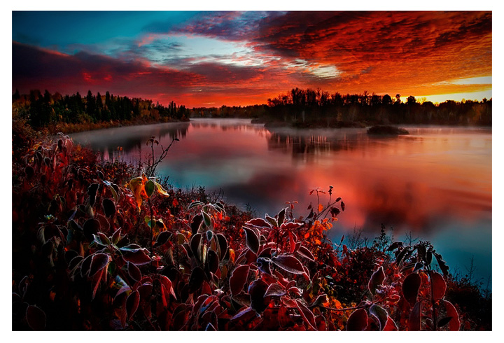
I would really appreciate any feedback or suggestions especially regarding increasing any potential depth in this image and whether color is oversaturated. The image consists in a double exposure that was manually blended. Thanks!

Comments

16 comments
Comment posted by INGOMA on January 22, 2013 at 11:56 PM
I like the composition here, Michel. The eye follows the left hand border of the image and is pulled to the right by the continuous cover of red clouds. An unusual composition, but I feel it works nicely. The saturation seems quite strong on my monitor. Nice work!
Registered on July 2, 2004, 231 Posts, 3110 Comments
Comment posted by Stan Rose on January 23, 2013 at 1:00 AM
Holy cow, that was some sunset! I think the sat looks about right, obviously the colors were strong here so i think they should be presented as such. The reds look in bounds. Id try to shift the cyan in the sky more towards blue though. I like the dark presnetation overall, but the vignette on the lhs is a bit much, epsecially up top where the sky goes nearly black. A few tweaks and this will be kliller! :wavey:
Registered on September 15, 2005, 836 Posts, 17099 Comments
Comment posted by Eirini Pajak on January 23, 2013 at 7:14 AM
The light here is awesome! I like the way some of the leaves are glowing echoing that incredible sky! I usually don't like lots of saturation but in this case it really works for me...
Registered on December 13, 2011, 216 Posts, 1671 Comments
Comment posted by Michael Cothran on January 23, 2013 at 8:36 AM
I think the reds seem super saturated, but on the other hand, I don't find them objectionable at all. I think it suits the image, and I think you've done a fine job of crafting it. I particularly like your foreground - the apparent reds in the foliage with the white edges (frost?) is nice eye candy. It appears that you added a darkening vignette to the left side. I'm a big fan of edge darkening, but I might point out that it IS noticeable in the sky. Whether that's good or bad is subjective. I wouldn't want it any darker in this instance, but IMO it's fine the way it is.
Registered on December 5, 2012, 31 Posts, 730 Comments
Comment posted by Kurt Budliger on January 23, 2013 at 9:46 AM
Comp and mood are nice, reds do seem a bit pumped but might seem more in line if the cyan/blue was adjusted as Stan suggests.
Registered on June 11, 2006, 113 Posts, 2116 Comments
Comment posted by Paul Marcellini on January 23, 2013 at 11:09 AM
Yeah, what Stan said. I would just try to eliminate the blacks in the sky.
Registered on November 27, 2007, 250 Posts, 2468 Comments
Comment posted by Rebecka on January 23, 2013 at 12:54 PM
WOW!! Eye-popping image. I happen to like it as is. Love how the foreground vegetation echoes the color of the sky. And again... WOW!!
Registered on February 5, 2009, 170 Posts, 924 Comments
Comment posted by Wayne Bartz on January 23, 2013 at 2:35 PM
I love the composition, I especially like how the foliage in the foreground has a glow to it. This is a shot to be proud of.
Registered on May 12, 2007, 56 Posts, 92 Comments
Comment posted by Dennis Harding on January 23, 2013 at 5:34 PM
This is a great image Michael but IMO it looks a bit dark and a little over saturated. I say this because both cyan and the reds are strong. I would recommend adjusting the density first then the saturation.
Registered on January 19, 2011, 33 Posts, 408 Comments
Comment posted by Robb Hirsch on January 23, 2013 at 6:09 PM
Nice composition, especially the foreground leaves. Looks like a pretty epic sunset. That being said, the saturation does look a little strong to me and maybe a little dark overall. A little more tweaking could make an already nice image really sing.
Registered on February 15, 2011, 16 Posts, 70 Comments
Comment posted by Vance Gese on January 23, 2013 at 10:21 PM
Whoa, that is some amazing color. Gorgeous.
Registered on November 13, 2008, 298 Posts, 6629 Comments
Comment posted by Michel Lamontagne on January 23, 2013 at 10:30 PM
Many thanks everyone for your comments and suggestions. This is very helpful and exacly what I was looking for! Michel
Registered on April 30, 2009, 9 Posts, 53 Comments
Comment posted by Zack Clothier on January 23, 2013 at 10:50 PM
I like the red foliage and the composition in general, not sure about the sky saturation, feels a bit heavy. Stan had a good suggestion.
Registered on January 28, 2010, 343 Posts, 2257 Comments
Comment posted by Gary Reed on January 24, 2013 at 7:56 AM
Michel, I like it as posted. Not sure if you will lose some focus on the nice front leaves if you lighten anything else. The mood would change for sure...If it were mine... I'd wipe my hands together and click print. :jump:
Registered on September 19, 2009, 198 Posts, 1074 Comments
Comment posted by Scott Smorra on January 24, 2013 at 9:10 PM
Very nice image Michel. The saturation is definitely high, but I don't feel it's over the top. I really like how you have reds in both the foreground and sky. If you can pull some of that cyan out the sky, I think you will have a winner.
Registered on November 2, 2009, 161 Posts, 2143 Comments
Comment posted by Ingrid Vekemans on January 31, 2013 at 9:41 AM
I like the image as posted. It is obvious that the image is saturated beyond reality but if it provides an attractive image like this one, well then that's fine, I would think? If you want the viewer to think this is a natural scene then I would reduce the saturation a little :smile:
Grt, Ingrid.
Registered on August 2, 2010, 138 Posts, 780 Comments