Gallery: LandscapePosted January 23, 2013769 views9 comments
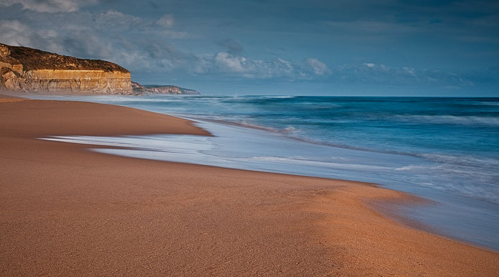
Stark contrast to my post of 2 days ago, this is a beach on the Great Ocean Road in Victoria, mainland Australia.
Enough going on here?
D300,Nikkor 16-85@35mm, 5 secs @ f/11, ISO 200
Comments
9 comments
Comment posted by Chet Dowell on January 23, 2013 at 9:45 AM
This image has a quiet, elegant beauty about it that I find very appealing and satisfying. Love the colors and the lighting and the curving lines. Well done!!! Chet
Registered on December 3, 2012, 237 Posts, 1171 Comments
Comment posted by Kurt Budliger on January 23, 2013 at 9:51 AM
Very pleasing comp, love the foreground. Sky feels a bit too dark though.
Registered on June 11, 2006, 113 Posts, 2116 Comments
Comment posted by Balan Vinod on January 23, 2013 at 10:20 AM
This is beautiful Neale...love the contrast in color and the soft light. The diagonal comp is very effective ...
Balan Vinod
Registered on March 20, 2006, 889 Posts, 2312 Comments
Comment posted by Paul Marcellini on January 23, 2013 at 11:08 AM
Nice color contrast and simple comp. The pano format works well too. Agree, the sky seems almost muddied.
Registered on November 27, 2007, 250 Posts, 2468 Comments
Comment posted by Nick Bristol on January 23, 2013 at 12:19 PM
Neale, This image has such a nice feel, just makes me want to be there! I like your comp and the pano format works really nice for this. I really enjoy the lines of the water.
Nick Bristol
Lone Rock, WI
Registered on February 1, 2004, 752 Posts, 14140 Comments
Comment posted by Vance Gese on January 23, 2013 at 10:26 PM
Love the warm tones in the sand and the wonderful blues in the water. Your composition is very successful in my opinion, with the great diagonal leading to the far bluffs, and the nice wash of surf in the foreground. I could see trying to up the contrast in the sky a bit, but a minor suggestion.
Registered on November 13, 2008, 298 Posts, 6629 Comments
Comment posted by Neale Dyster on January 24, 2013 at 4:48 PM
Thanks for comments, in an effort to get more detail in the clouds, I agree, the sky became too dark or muddy looking. In this repost I've reworked the sky with hopefully, better results.
Registered on February 19, 2008, 94 Posts, 738 Comments
Comment posted by Aaron Feinberg on January 24, 2013 at 7:23 PM
Looks a bit middle gray, so just a bit of levels tweak but like the depth from the lines. Might work very well in b/w too. :)
aF
p.s. just saw the new version...better...but lost some contrast esp in the fg. what are you using to edit?
Registered on October 26, 2009, 399 Posts, 2789 Comments
Comment posted by Neale Dyster on January 25, 2013 at 12:28 AM
Thanks Aaron, I use Lightroom and CS4, also TK's triple play actions.
I'll have another play with it sometime soon.
Registered on February 19, 2008, 94 Posts, 738 Comments

Comments
9 commentsBalan Vinod
Nick Bristol
Lone Rock, WI
aF
p.s. just saw the new version...better...but lost some contrast esp in the fg. what are you using to edit?
I'll have another play with it sometime soon.