Nature Photographers Network
This is the preserved archive of the original Nature Photographers Network. The community continues at naturephotographers.network.
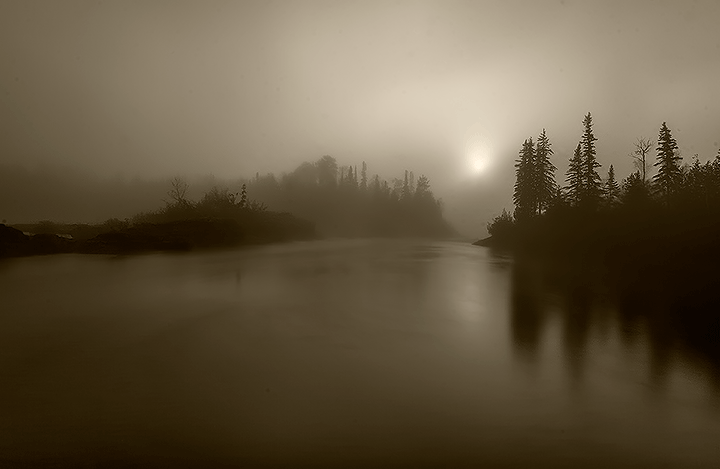
Foggy Kap River
‹ PreviousLandscape GalleryNext ›

Foggy Kap River

by Michel Lamontagne

Gallery: LandscapePosted March 31, 2013195 views15 comments
Took this image in early morning last fall in a heavy fog on Kap River in Northern Ontario. One exposure processed in Camera Raw and CS6, Due to the fog, the image naturally has a sepia tome but for better consistancy, I converted in black and white and then sapia. Any comments regarding composition, contrast or anything else would be greatly appreciated.

Comments

15 comments
Comment posted by Michel Lamontagne on March 31, 2013 at 11:25 PM
..and one other thing. Which do you prefer, blue or sapia tone? Thanks for you feedback! ML
Registered on April 30, 2009, 9 Posts, 53 Comments
Comment posted by Bruce King on April 1, 2013 at 12:59 AM
They're both very good but diferent images expressing different moods. I like the blue. Is there some halos at the trees on the right or am I seeing things? Beautiful images very natural and earthy.
Registered on January 14, 2010, 276 Posts, 2212 Comments
Comment posted by Mark Metternich on April 1, 2013 at 2:03 AM
Fabulous atmosphere and image! I like the sepia version best. Great job. :toast:

Maybe a tad too much halo on the right main trees?
Registered on June 19, 2009, 276 Posts, 6240 Comments
Comment posted by Harry Lichtman on April 1, 2013 at 7:25 AM
Moody and eerie - fantastic. I'm not usually a sepia fan, but I think it works for this. With the sun in the image, I'm leaning toward the 1st post as it makes sense to have a warmer feel. The blue is nice as well. Have you tried a straight B&W conversion?
Registered on September 17, 2010, 304 Posts, 3507 Comments
Comment posted by Bill Reid on April 1, 2013 at 7:48 AM
Very nice mood in this scene Michel. I always enjoy fog images and this is very nicely done. Prefer the sepia but both are great.
Registered on January 27, 2013, 65 Posts, 2460 Comments
Comment posted by Roel Wijtmans on April 1, 2013 at 8:13 AM
I definitely like the blue one more, but I'm no fan of sepia... I do think I see three dust particles above the trees as well. But a very nice image!
Registered on September 30, 2012, 116 Posts, 2257 Comments
Comment posted by Michel Lamontagne on April 1, 2013 at 12:34 PM
Many thanks for your comments everyone. Mark and Bruce, thanks for pointing out the halos...some over sharpening there and I will certainly clean up the image better Roel. In terms of the sepia vs blue comments, I thought I would post the original colour version before I did the black and white conversion. As for trying it out in B&W....I'll need more time to experiment with that version but will do. Thanks again!
Registered on April 30, 2009, 9 Posts, 53 Comments
Comment posted by Roel Wijtmans on April 1, 2013 at 1:24 PM
That's funny, I actually like this one the most! I really like the gradients in the sky and water.
Registered on September 30, 2012, 116 Posts, 2257 Comments
Comment posted by R.Bill Moser on April 1, 2013 at 1:29 PM
Great mood here. I like both of them but would prefer the first version. Great job
Registered on January 29, 2010, 285 Posts, 4281 Comments
Comment posted by Bill Chambers on April 1, 2013 at 1:53 PM
Beautiful. I'm usually not a big fan of sepia toned images, but this fits perfectly. I much prefer the B&W rendering. So moody and inviting.
Registered on April 10, 2005, 753 Posts, 21216 Comments
Comment posted by Michael Cothran on April 1, 2013 at 2:19 PM
This is absolutely beautiful. I prefer your original post.
Registered on December 5, 2012, 31 Posts, 730 Comments
Comment posted by Bruce King on April 1, 2013 at 3:45 PM
I like the original too.......so all three....yes
Registered on January 14, 2010, 276 Posts, 2212 Comments
Comment posted by Dietrich Gloger on April 6, 2013 at 6:18 AM
I liked the sepia toning more than the blue, but the color version is actually my favorite. Also, the composition works very well for me. A great mood and moment you captured here.
Registered on January 26, 2007, 360 Posts, 9876 Comments
Comment posted by Michel Lamontagne on April 6, 2013 at 8:49 AM
thanks everyone for your feedback!
Registered on April 30, 2009, 9 Posts, 53 Comments
Comment posted by Lucy Aron on April 6, 2013 at 2:45 PM
Lovely moody image. My vote is for the sepia.
Registered on February 25, 2011, 189 Posts, 1160 Comments