Nature Photographers Network
This is the preserved archive of the original Nature Photographers Network. The community continues at naturephotographers.network.
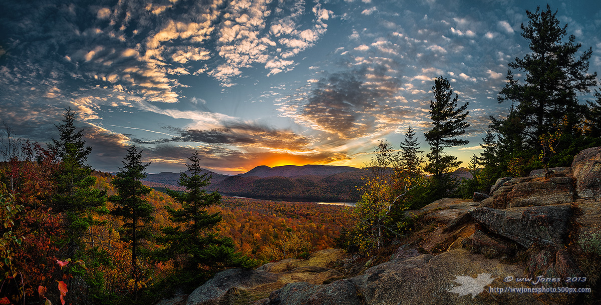
Fire Beyond Bullhead Mt.
‹ PreviousLandscape GalleryNext ›

Fire Beyond Bullhead Mt.

by Wayne Jones

Gallery: LandscapePosted October 22, 2013736 views17 comments
This was shot five and half minutes after the image I posted yesterday ("Breathless")

I was hoping that the altocumulus clouds would light up in intense, glowing red rows like other sunsets I had photographed in the past. After shooting the first pano however, the clouds started breaking up, so I moved my tripod a bit to try to include a bit more of the valley below the cliff in the next series of exposures. The result is not the rows of red clouds I came for, but it will do.

Canon 5D3
Canon 24-105mm.; Circ. Pol.
1/6 sec. @ f/16 for the sky and 1 sec. @ f/16 for the land, at ISO 160
Ten exposures hand-blended into 5 vertical frames, and then stitched in CS6

Comments really appreciated, as I already have a print request for this one. (A visitor to my house saw a bunch of my recent captures and chose this over the rest. I'm guessing the color in this one is what attracted him. Interesting to see what "non-photographers" like.)
Please see the larger version.

Comments

17 comments
Comment posted by Stan Rose on October 22, 2013 at 11:13 PM
No, i dont think it was the color Wayne--it was probably that weird white petroglyph in the lrhc...not wait, that's your watermark :biggrin:
Well, I like the comp a lot, very well laid out and balanced, with good perspective. Color is good too. I think it needs some minor tweaks to the contrast to get rid of that hint of HDRish look that i personally don't care for. The ulhc needs to be brighter, as does the whole sky for that matter, and maybe a bit darker in the transition zone with the distant hills. I woud argue: don't be afraid of the darks! And the brights, too. So what if you blow the sunset area, theres no rule that the histogram has to contain every pixel. It's partly personal taste i admit though--cause the hdr here does give it more of a painting-like look. I just prefer good ol fashioned photos. :wink: Love the clouds! :smile:
Registered on September 15, 2005, 836 Posts, 17099 Comments
Comment posted by Wayne Jones on October 22, 2013 at 11:25 PM
Thanks Stan! I really appreciate the thoughtful critique. Good points; my two exposure blend needs more blending! In fact, I may even try just using a single exposure. The upper corners of the sky were not touched in my processing -- just the way it was, but maybe it will not look so drastic when I brighten the whole sky.

I will have to give this some thought, because the other photo my customer liked most was an artistic "painting" version of another fall scene on my wall. He says he has some paintings on his walls, but no photos, so that makes sense. But for this kind of scene, I'm with you: I like "good ol fashioned photos," and it's still my image. I'm not in this for the money, so I'll remember Rick Nelson's advice from "Garden Party."
Registered on April 18, 2007, 953 Posts, 6435 Comments
Comment posted by Stan Rose on October 22, 2013 at 11:28 PM
In fact, I may even try just using a single exposure.

Right--with the 5d3 it should be a piece of cake so long as you got one good exposure.
Registered on September 15, 2005, 836 Posts, 17099 Comments
Comment posted by Wayne Jones on October 22, 2013 at 11:38 PM
Stan, that's a good point. I think that trying to take advantage of the capabilities of the equipment and the software may be giving me an identity crisis.
Does anyone know where I can get some Kodachrome processed? :wink:
Registered on April 18, 2007, 953 Posts, 6435 Comments
Comment posted by John Williams on October 23, 2013 at 12:35 AM
Interesting how the sky changed in that period; I prefer this version. I do agree that the dark/light contrasts give a slight HDR appearance.
Registered on September 6, 2007, 221 Posts, 5985 Comments
Comment posted by John&Patty Benway on October 23, 2013 at 6:08 AM
Wayne, this is gorgeous, what a pretty scene, love the pano, and every thing else that goes along with it, I don't see a single thing I don't like about it. In my honest opinion, BEAUTIFUL WORK. Take care.
John
Registered on May 12, 2006, 626 Posts, 8700 Comments
Comment posted by Phil Pogledich on October 23, 2013 at 8:49 AM
My first thought, before reading any of the comments, was that there is a bit of an HDR feel. Stan's comments echo my own thoughts. Like Stan though, I think the image is finely composed and quite engaging overall. Some processing refinements will really bring this home in a powerful way. That said, I can certainly understand leaving it as-is given the favorable reception it's already received...

Registered on August 24, 2009, 123 Posts, 3099 Comments
Comment posted by Bill Reid on October 23, 2013 at 8:55 AM
A very beautiful scene Wayne. Really like the details in the fore and mid grounds and great colors. I agree with Stan's comments on the sky being a little too dark. But this is a wonderful image and with a tweak or too it will be a stunner. Great job on this. :toast:
Registered on January 27, 2013, 65 Posts, 2460 Comments
Comment posted by Morris McClung on October 23, 2013 at 12:31 PM
A ton of pleasing elements in this one, Wayne. Great color, which is always a hook for me. But, I really like expert way you assembled the pano to work this well. Very difficult to do, but you made it look easy. :toast:
Registered on May 7, 2007, 670 Posts, 19650 Comments
Comment posted by Bill Chambers on October 23, 2013 at 4:52 PM
Wow, tough call Wayne. I like the brilliance of the blue sky in the previous image but like the perspective of this shot best. Both are wonderful, but I'll have to study them more before calling a favorite.
Registered on April 10, 2005, 753 Posts, 21216 Comments
Comment posted by Ed Lowe on October 23, 2013 at 6:09 PM
I think I like this even more than your prior post, Wayne. You still have the wonderful view of the valley below along with a little warmth in the sky. My only suggestion would be to lighten the overall image just a touch and this is being super picky because I'm sure your non photo friend did not notice, but I would clone out that jet contrail. Congrats on the print request.

Ed
Registered on February 7, 2004, 414 Posts, 7115 Comments
Comment posted by Mark Metternich on October 27, 2013 at 12:41 PM
Wonderful scene! :toast:

A couple tweaks and it will be great.
Registered on June 19, 2009, 276 Posts, 6240 Comments
Comment posted by Mike Ramy on October 31, 2013 at 12:25 AM
Wayne,
One heck of a scene and masterfully captured,
Congratulations on the WP . . . :toast:
Registered on June 16, 2012, 567 Posts, 2809 Comments
Comment posted by Daniel & Loana on November 1, 2013 at 5:24 AM
Wonderful shot, Wayne.
Congrats on the WP!
D&L
Registered on October 7, 2008, 166 Posts, 3044 Comments
Comment posted by Bill Fach on November 2, 2013 at 1:08 AM
Wayne: Fabulous scene superbly captured. The larger view is spectacular but only hints at what a large print would show. Congrats on a well deserved WP. >=))>
Registered on November 1, 2003, 1805 Posts, 26981 Comments
Comment posted by SandyRichardsBrown on November 5, 2013 at 1:58 PM
Nice comp and delightful combination of elements and colours.
Another very well-deserved WP! Congrats!

Sandy
Registered on November 24, 2003, 3937 Posts, 12909 Comments
Comment posted by Mark Seaver on November 7, 2013 at 9:23 AM
I missed this one, Wayne. It's great and well deserving of the WP. Congrats.
Registered on January 23, 2011, 1103 Posts, 17270 Comments