Nature Photographers Network
This is the preserved archive of the original Nature Photographers Network. The community continues at naturephotographers.network.
St. Clair Beach
‹ PreviousMan & Nature GalleryNext ›

St. Clair Beach

by Tim Mulholland

Gallery: Man & NaturePosted March 13, 2014269 views12 comments
While we were living in New Zealand, one of our favorite cities to visit was Dunedin. (Actually, it's the city where were hoping to live, but that's the way it goes.) Dunedin is a beautiful city that has a feeling similar to that of San Francisco, but much smaller and not quite as funky. Another issue with Dunedin is that while it's a very beautiful city, it's not as close to as much of the spectacular scenery as where we lived in Invercargill.

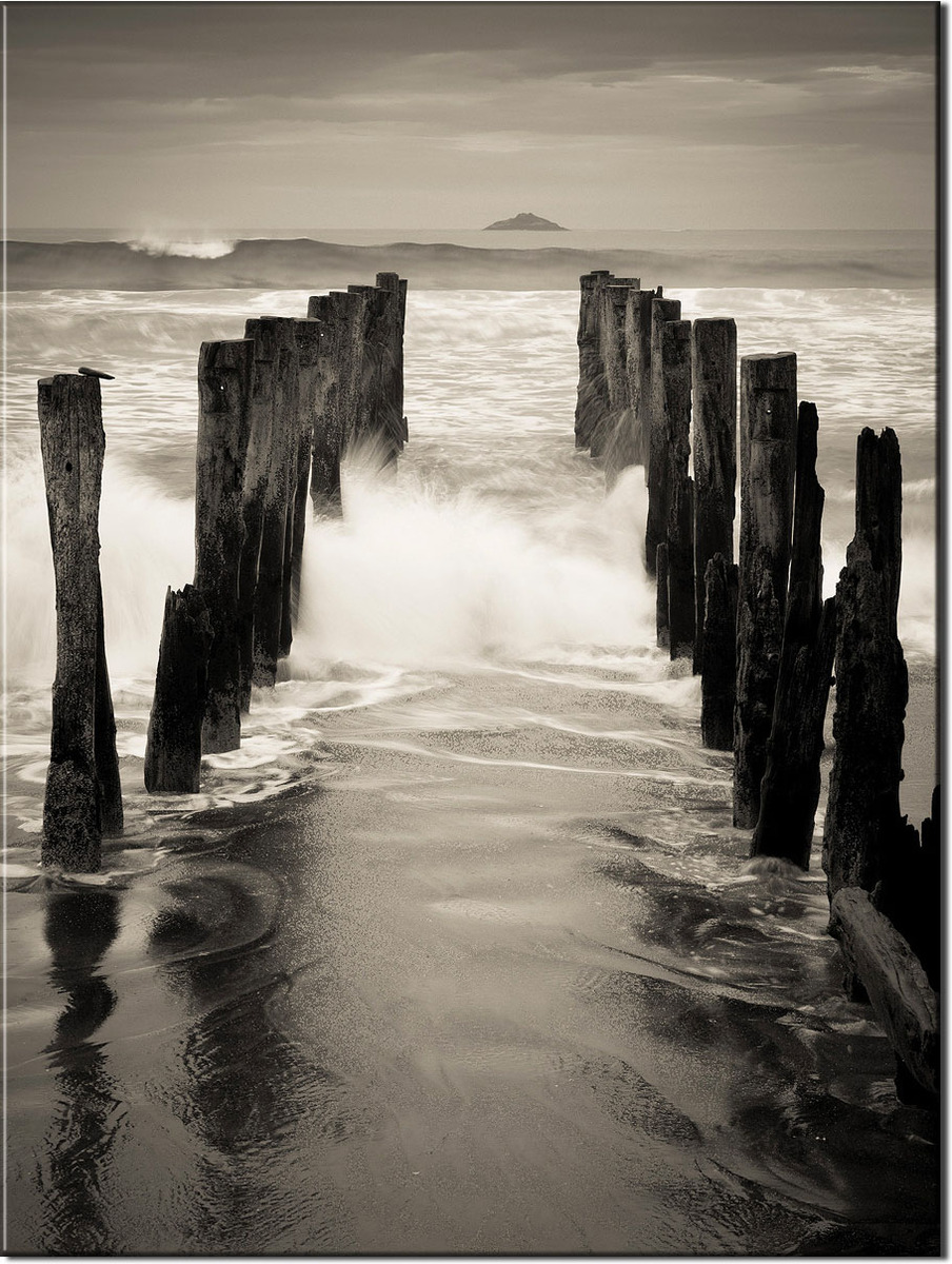
Somewhere along the way, I remember seeing an image of St. Clair Beach and this particular abandoned pier. This was an excellent place to "work" an area for a photographic study and trying different compositions, and then different image work-ups. It also helped that it was an overcast day to help give great mood to the image.

Enjoy,

Tim!

Comments

12 comments
Comment posted by Daniel Finchum on March 13, 2014 at 9:04 PM
A beautiful b/w. Although the wave on left side might be distracting to some, I like it, as it explains the water movement around the old posts. The larger version is marvelous and would love to see this as a large print.
Registered on September 8, 2013, 43 Posts, 222 Comments
Comment posted by gary phillips on March 14, 2014 at 1:29 AM
Very nice, Tim. I really like the fg texture and the beautiful wave action. I think the breaking wave on the left adds a visual tension to the shot as you can feel the progression of the wave as it comes ashore. If I had any nit at all, it would be to try to pull a little mor detail out of the sky . Nice work.
Registered on October 24, 2013, 185 Posts, 4136 Comments
Comment posted by Jared Warren on March 14, 2014 at 2:35 AM
Great image, Tim. I really like the mood and interesting water action. Great choice for monochrome/b&w. Thanks for sharing! May be a candidate for man & nature forum.
Registered on May 11, 2012, 84 Posts, 931 Comments
Comment posted by Tim Mulholland on March 14, 2014 at 9:09 AM
Thank you all for your comments - I appreciate them!

Gary, I see your point - good for for thought...

Tim!
Registered on April 24, 2006, 14 Posts, 139 Comments
Comment posted by Paul Breitkreuz on March 14, 2014 at 11:54 PM
Tim, I agree this is a better fit for the M&N gallery, however, regardless of where it is presented this works extremely well. The pillars do a perfect job of guiding our view toward the waterfront and out to the distant island. The small amount of wave action also adds to this dynamic scene.
I would be tempted to work with a bit more contrast and or saturation, but that stuff is minor and personal taste overall. For me it is all about the composition and dramatic weather here on this one. Very nicely done. :cool:
Registered on February 25, 2006, 525 Posts, 8448 Comments
Comment posted by Bill Reid on March 15, 2014 at 11:33 AM
Very nice tones and composition Tim and the toning looks very nice also. Nicely seen.
Registered on January 27, 2013, 65 Posts, 2460 Comments
Comment posted by Eva McDermott on March 15, 2014 at 5:40 PM
Hi Tim - Like your B&W treatment. The pylons are a great lead in to the distant mountain. That said, I moved your image to M&N due to the obvious man made elements. Hope you understand.
Registered on January 4, 2009, 1015 Posts, 13229 Comments
Comment posted by Luke Ormand on March 17, 2014 at 9:59 AM
Good shutter speed - B&W treatment works well also. I think I would prefer the island in the BG to be centered or way off centered instead of how it's positioned.
Registered on February 4, 2009, 1093 Posts, 7035 Comments
Comment posted by Matthew Goldsmith on March 17, 2014 at 10:18 AM
Great feeling of movement here. I think leaving less contrast in the sky helps draw me into the foreground.
Registered on June 29, 2010, 37 Posts, 286 Comments
Comment posted by Harley Goldman on March 17, 2014 at 6:25 PM
Real nice work, Tim. I like this a lot!
Registered on November 19, 2003, 586 Posts, 11271 Comments
Comment posted by Roberto Facchini on March 18, 2014 at 6:14 AM
Great perspective. Excellent choice of B / W.
Registered on November 15, 2012, 35 Posts, 202 Comments
Comment posted by Vance Gese on March 18, 2014 at 6:04 PM
Love the design of your composition, with the pilings so prominent in the foreground leading the eye back to that island. The b/w works so very well.
Registered on November 13, 2008, 298 Posts, 6629 Comments