Nature Photographers Network
This is the preserved archive of the original Nature Photographers Network. The community continues at naturephotographers.network.
Heart of Darkness v2
‹ PreviousLandscape GalleryNext ›

Heart of Darkness v2

by Navin Sarma

Gallery: LandscapePosted June 8, 2014140 views8 comments
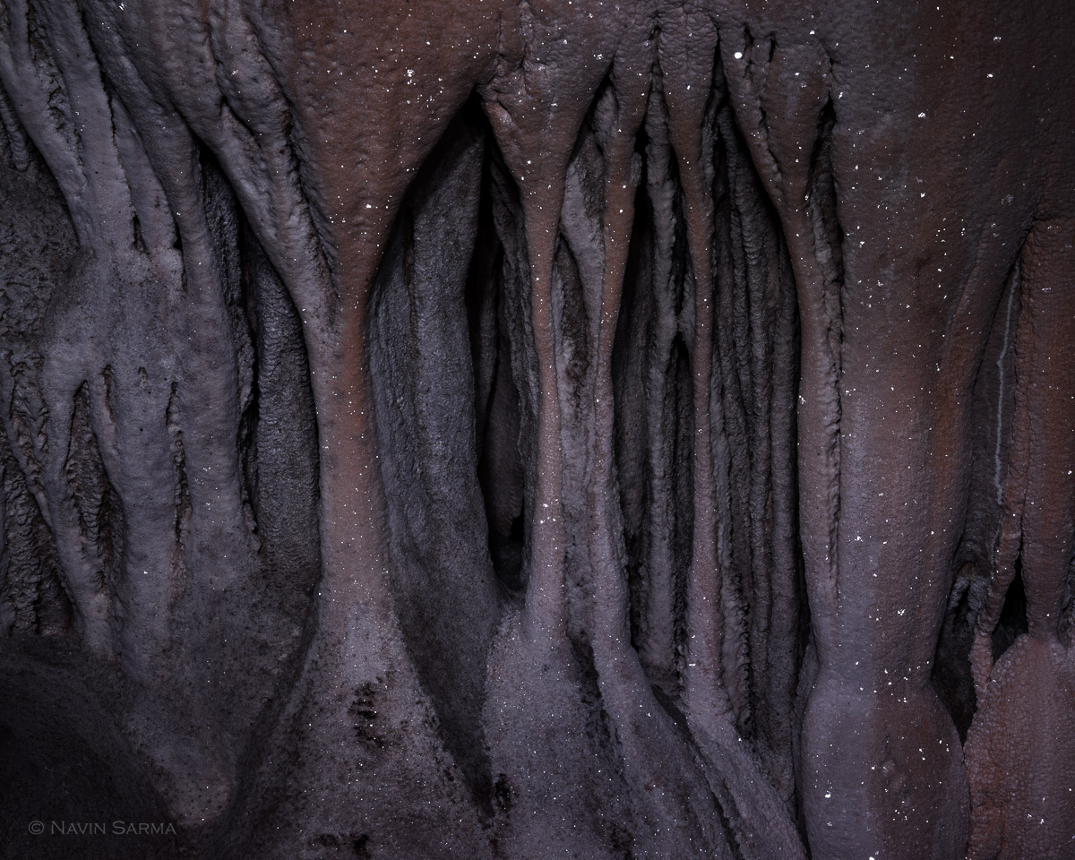
Another attempt at this image from the Crystal Cave, Belize. I went for less dodging/burning and sat than v1 and burning but kept it dark to emphasize the sparkles. Your C&C is appreciated.

Nikon D800, Nikon 24-70, f/18, 8 sec, ISO 250, illuminated with my LED headlamp

Comments

8 comments
Comment posted by Preston Birdwell on June 8, 2014 at 6:05 PM
Interesting textures and shapes, here, Navin. I do think it's too dark. I believe you could raise the threshold without destroying the sparklies.

You know what the caver's lament is? "It ain't cat poop, and it aint' mouse poop, so it's gotta be...bat poop!" :biggrin:

--P
Registered on November 1, 2003, 471 Posts, 5188 Comments
Comment posted by Philip Hodgkins on June 8, 2014 at 7:58 PM
A bit dark, but certainly unique, Navin. I think I liked V1 better. :smile:
Registered on July 24, 2006, 2741 Posts, 12349 Comments
Comment posted by Paul Breitkreuz on June 8, 2014 at 8:27 PM
Navin, I really like the mystique of this one as well as the more subtle processing over the other you've linked. I do agree it's a bit dark, but in a print if presented at this level the viewing should be just fine. Some very interesting stalactite and stalagmite growths or conjoinment. :cool:
Registered on February 25, 2006, 525 Posts, 8448 Comments
Comment posted by Dan Kearl on June 9, 2014 at 12:22 AM
I might lighten it just a tad in the lower left corner.
Another very interesting cave photo…...
Registered on September 2, 2013, 209 Posts, 1514 Comments
Comment posted by Vance Gese on June 9, 2014 at 12:39 AM
I really enjoyed your first posting of this image and have to admit that I do prefer that version over this one. The forms and lines are really nice and I can appreciate the more subdued processing here. Both versions are really nice though.
Registered on November 13, 2008, 298 Posts, 6629 Comments
Comment posted by gary phillips on June 9, 2014 at 8:51 PM
I vote for version 1, Navin. I think both are outstanding, but V1 appears to have more depth and interest to me. Love the sparkles. :wavey:
Registered on October 24, 2013, 185 Posts, 4136 Comments
Comment posted by Stuart Williams on June 10, 2014 at 5:13 AM
i think that this is begging for a b&w conversion and some playing with tonalities ... interesting place!
Registered on December 7, 2007, 247 Posts, 4792 Comments
Comment posted by Bill Reid on June 11, 2014 at 11:38 AM
I think I prefer the first version Navin as it has a little more pop to it. Both are quite interesting though.
Registered on January 27, 2013, 65 Posts, 2460 Comments