Nature Photographers Network
This is the preserved archive of the original Nature Photographers Network. The community continues at naturephotographers.network.
D.D.D.D.
‹ PreviousFlora GalleryNext ›

D.D.D.D.

by Nathan Buck

Gallery: FloraPosted October 6, 2014192 views13 comments
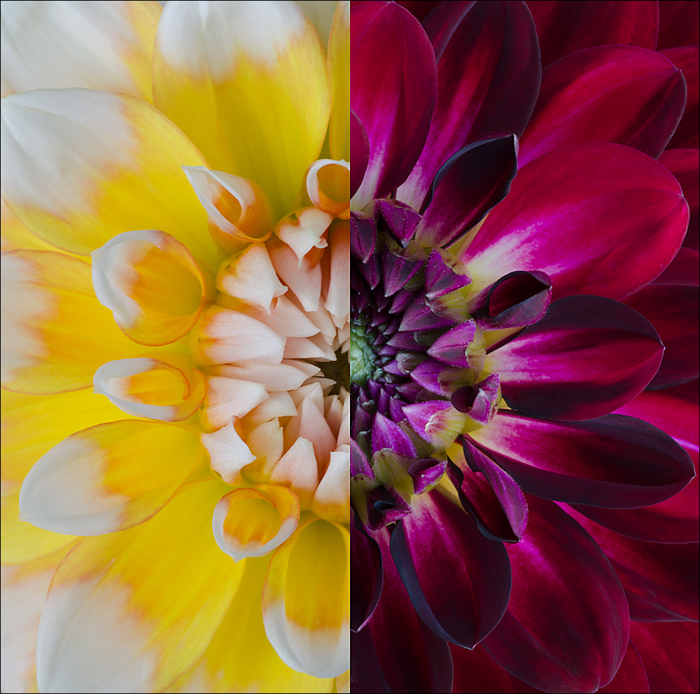
Dual Dahlia Diptych Deux

Hi all.

Revisiting the dahlia diptych that I posted the other day. I followed suggestions here by eliminating the line in between the blooms, and also cropping more for comp.

My son, when I was editing it, suggested turning the photo on its side. I ended up liking that more too - but will include the horizontal version in a comment.

Please be honest - any thoughts appreciated!

Nathan

Nikon D7000, Sigma 180 macro, tripod, ISO 400, f16 for dark, f11 for yellow

Comments

13 comments
Comment posted by Nathan Buck on October 6, 2014 at 12:28 PM
Here is the horizontal. Same specs.

Nathan
Registered on November 1, 2003, 1101 Posts, 13589 Comments
Comment posted by S Govindarajan on October 6, 2014 at 2:19 PM
Excellent, Nathan. Beautifully done! I prefer the vertical composition. :toast:
Registered on April 19, 2008, 115 Posts, 1921 Comments
Comment posted by Gary Reed on October 6, 2014 at 6:22 PM
Nathan, much better, I prefer the vertical as well. :toast:
Registered on September 19, 2009, 198 Posts, 1074 Comments
Comment posted by scott lanz on October 6, 2014 at 9:19 PM
Very cool, Nathan. I also like the vertical.
Registered on November 14, 2003, 840 Posts, 12902 Comments
Comment posted by Ken Smith on October 7, 2014 at 1:13 AM
Funny how we all prefer vertical. Clever and creative. Nice to see.
Registered on September 5, 2008, 449 Posts, 2444 Comments
Comment posted by Nathan Buck on October 7, 2014 at 1:17 AM
Thanks everyone. To me, Ken, the vertical just feels more dynamic.

Nathan
Registered on November 1, 2003, 1101 Posts, 13589 Comments
Comment posted by Ramamohan Pai on October 7, 2014 at 7:40 PM
Nathan - Wonderful rework. Vertical for me too. Somehow makes it complete that way.

I wonder if a lighter shade and hence less contrasty Dahlia to pair with would have made any difference.
Registered on November 1, 2003, 550 Posts, 9037 Comments
Comment posted by Nathan Buck on October 7, 2014 at 7:42 PM
Thanks Ram. I have others that I have shot this way, so I might try that out. Thanks! :smile:

Nathan
Registered on November 1, 2003, 1101 Posts, 13589 Comments
Comment posted by Gary Yeoh on October 7, 2014 at 8:53 PM
Nathan:

This is not working for me (guess it is just a personal preference as others seem to like these). The image looks a little disjointed; the contrast of yellow and red is too jarring. Apart from the central circle, there is little symmetry at the peripheral.
Registered on September 1, 2009, 588 Posts, 8184 Comments
Comment posted by Philip Hodgkins on October 7, 2014 at 9:47 PM
An original construct. Vertical for me. My very small nit is the misfit on the complementary colors. Yellow and purple are good, but there needs to be some green for the red.
Registered on July 24, 2006, 2741 Posts, 12349 Comments
Comment posted by Albert Darmo on October 8, 2014 at 10:26 AM
Hi Nathan :wavey: I too go along with the vertical version. very creative and fascinating color and lines..


Albert Darmo
Canada
Registered on November 25, 2008, 1386 Posts, 11978 Comments
Comment posted by Pat Sampson on October 8, 2014 at 5:17 PM
I prefer the vertical Nathan. Colorwise, I agree with Gary. The colors do seem to conflict to me. Also the solid center in the purple/red vs the hollow center in the yellow creates a disjointedness for me. That said, I hope you do more of these. They interest me.

pat
Registered on May 19, 2007, 953 Posts, 15989 Comments
Comment posted by Bill Fach on October 8, 2014 at 6:50 PM
Nathan: 5 run homer! I agree with your son in liking the vertical orientation of the flowers more. Another thing that makes this for me is the subtle yellow parts of the dark dahlia. Makes the link between them seem less arbitrary. Marvelous work. >=))>
Registered on November 1, 2003, 1805 Posts, 26981 Comments