Nature Photographers Network
This is the preserved archive of the original Nature Photographers Network. The community continues at naturephotographers.network.
Changing of the Guard I
‹ PreviousLandscape GalleryNext ›

Changing of the Guard I

by Wayne Jones

Gallery: LandscapePosted October 29, 2014241 views14 comments
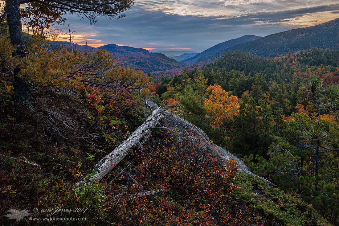
... a prequel

Well, I tried to post another version of the scene I posted last night, and got the "supersaturation cyan blues" again. (God knows when but you’re doin’ it again) This time I managed to delete it before anyone commented, so I could drain all the cyan and blue from any parts that looked cyan, and post it again. (Not the first time this has happened.)

WHICH ONE?
This is a "prequel" to my previous post, same scene, but shot a bit earlier as a test shot. Since this is a single frame (20 MP vs. the 65 MP stitch of the other shot), I want the bigger one to work. The PSD of the larger one actually looks more like this, except for the changing clouds and somewhat different light. I was concerned that the bright patch of sky in this one was distracting, so I thought I would see what you think.

QUESTION: If you can imagine the previous post without the oversaturation, would you prefer this one with the patch of bright sky, or the one I posted last night?

THANKS

Comments

14 comments
Comment posted by Brian Schrayer on October 29, 2014 at 10:43 PM
Wayne, I think the earlier image is definitely worth re-processing. I like the light as well as the range of autumn color. I'm not quite sure about the tree on the upper left - it seems to create a bit of imbalance in the image to my eye, but I'm being picky. :biggrin:
Registered on May 28, 2004, 114 Posts, 2890 Comments
Comment posted by Stan Rose on October 29, 2014 at 11:23 PM
Beautiful scene, Wayne, love the depth here!
I actually like the 'super' saturation of the earlier one--a colorful scene outhta be colorful. You can always keep the blues down while boosting the warm colors. It's good no matter how ya shake it.
Registered on September 15, 2005, 836 Posts, 17099 Comments
Comment posted by scott lanz on October 30, 2014 at 7:24 AM
Hi Wayne. I prefer the more natural colors presented here (to my eye and monitor), but to answer your specific question about the sky, I have no preference. Helpful, huh? Beautiful capture of adirondack in fall.
Registered on November 14, 2003, 840 Posts, 12902 Comments
Comment posted by Pat Sampson on October 30, 2014 at 7:48 AM
It's marginal for me Wayne but I prefer the first. I actually like the tighter comp in the second more but I think it has less mood and that's the main appeal of the image for me. To my eye the tighter diagonals in the second and the lighter sky make it pop more and while it may be stronger for me technically, it looses some of the Fall/end of day feeling.

pat
Registered on May 19, 2007, 953 Posts, 15989 Comments
Comment posted by Richard Teller on October 30, 2014 at 8:14 AM
Great depth to this image. I also like the layers. Your have captured the feeling of the change of seasons very well in this image.
Registered on August 23, 2010, 1162 Posts, 6692 Comments
Comment posted by John&Patty Benway on October 30, 2014 at 10:15 AM
Wayne, I think I prefer the original post, this one seems to be a tad dark, still has a very nice Adirondack mood. For me, photography is about bringing the viewer into the scene with emotion, mood if you will, and with that said, they both work well for me.
Take care.
John
Registered on May 12, 2006, 626 Posts, 8700 Comments
Comment posted by Wade Hardy on October 30, 2014 at 10:22 AM
Wonderful image, composition, etc. I like how the previous image has more pop to it. This version seems just a little flat to me. Also, for me, the extra sky in the this image is a non factor with the overall composition...
Registered on May 2, 2006, 121 Posts, 1824 Comments
Comment posted by Ed Lowe on October 30, 2014 at 10:23 AM
While both versions are very beautiful I prefer the original post because of the brighter sky, Wayne. This grand view has some wonderful depth with the receding mountains and shows the Adirondack autumn beautifully. Nicely done.

Ed
Registered on February 7, 2004, 414 Posts, 7115 Comments
Comment posted by Jim Greenwood on October 30, 2014 at 11:06 AM
I cast my vote for the previous version. I agree with Stan. I don't think that the previous image is over-saturated, although I might suggest just reducing the blue saturation on the fallen tree trunks.
Registered on November 9, 2003, 229 Posts, 1523 Comments
Comment posted by Mark Seaver on October 30, 2014 at 11:08 AM
This makes for a very interesting comparison, Wayne. I much prefer the previous post, largely because there's a lot more detail in the foreground. Yes the sky in the earlier post seems over cooked, but that should be fixable in post.
Registered on January 23, 2011, 1103 Posts, 17270 Comments
Comment posted by Ryan Shain on October 30, 2014 at 10:34 PM
I am going to lean towards the previous post Wayne. Again, a grand view!!
Registered on February 20, 2007, 226 Posts, 4571 Comments
Comment posted by gary phillips on October 31, 2014 at 3:06 AM
Wayne, I had to go back and view you're previous post to make a comparison. First of all I'm glad you are back, I've missed your contributions and I always enjoy your work. Took a little time off myself so it made made me happy to see you posting again :wavey: . I think the the stitch is hands down more appealing than version 2. The depth and detail in that version made it for me. I've been to the top of Baxter in the fall of 1977 and these shots bring me right back. Beautiful work as always :toast: :toast:
Registered on October 24, 2013, 185 Posts, 4136 Comments
Comment posted by Rick Turner on October 31, 2014 at 12:18 PM
Great spot to shoot. I like this one best but both are top notch. :toast:
Registered on February 18, 2012, 534 Posts, 2755 Comments
Comment posted by Nick Bristol on October 31, 2014 at 7:05 PM
Wayne, This one is very nice but I prefer the first one. Since the first one is a 3 image stitch I would go with that if you want to print this large, and especially so when it looks closer to this one color wise (saturation) in your PSD file. It is really nice work on either image! :toast:

Nick Bristol
Lone Rock, WI
Registered on February 1, 2004, 752 Posts, 14140 Comments