Gallery: LandscapePosted November 20, 20143,062 views11 comments
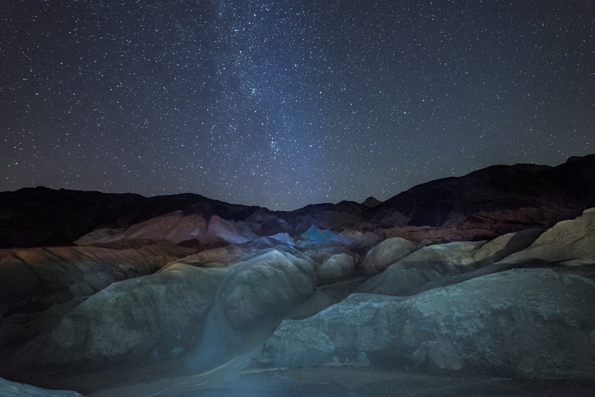
Another Death Valley Icon that I shot in the dark.
25 sec., 14mm f2.8, iso4000, D800
Comments
11 comments
Comment posted by Richard Teller on November 20, 2014 at 9:42 PM
The landscape looks like a painting. I like the lighting and colors of the foreground and the sky just adds to the over all image.
Registered on August 23, 2010, 1162 Posts, 6692 Comments
Comment posted by Mark Seaver on November 20, 2014 at 10:05 PM
The combination of shapes and colors in the foreground against that great sky are wonderful, Dan. It seems to me that there's a touch of extra brightness near the bottom and just to the left of center, that feels like a reflection of the Milky Way, but I know it can't be, so I think a touch of burning in there would be helpful. I'm also curious about why the distant peaks are totally dark yet the hills leading up to them are reasonably bright?
Registered on January 23, 2011, 1103 Posts, 17270 Comments
Comment posted by Dan Kearl on November 20, 2014 at 10:09 PM
Mark,
I should have mentioned but thought it was obvious that I light painted this with a small flashlight.
I just could not light up the peaks which were a long way away.
Registered on September 2, 2013, 209 Posts, 1514 Comments
Comment posted by Wayne Jones on November 20, 2014 at 11:41 PM
Beautiful sky. I like that it's not overly bright. On the other hand, the light painting gives me the impression that I am looking at this scene from a vehicle with the headlights on. Just my personal taste, but I would rather see more subtle lighting in the foreground. Whether you like bright or dim night scenes, I think the saturation of that rock in the center of the mid-ground looks like kind of strange. Above that, the mountains and stars look great.
Registered on April 18, 2007, 953 Posts, 6435 Comments
Comment posted by Jeff Martyka on November 21, 2014 at 1:40 AM
I really like the otherworldly feel of the image. It has this aliens are beaming a blue light down into the scene feel with the light painting.
The area Mark mention at the bottom center feels strange...almost foggy and draws my eye. I'd experiment with a crop reducing some of the bottom to focus in on that central blue area. Or maybe adjust the WB/cyan on the foreground rock...it does seem a bit blue there.
The horizontal line of light does look like car headlights hitting the scene. On the one hand, it takes something away from the scene. On the other hand, I immediately thought car headlights and a story comes to mind about some kids driving up to investigate this glow coming down from the sky.
Definitely interesting...conjures up stories for me.
Registered on June 20, 2014, 30 Posts, 155 Comments
Comment posted by Prashant Khapane on November 21, 2014 at 3:49 AM
Really like a painting this one. I like how the middle bit is illuminated however is it intentional or natural? I might crop the bottom a bit.
Registered on November 1, 2003, 492 Posts, 4580 Comments
Comment posted by Mark Zelinka on November 21, 2014 at 1:17 PM
I really dig this. It has an experimental, otherworldly feel. Is this planet earth?
Registered on August 20, 2007, 206 Posts, 998 Comments
Comment posted by Harley Goldman on November 21, 2014 at 5:58 PM
This really does look like a painting. Very surreal. I would either burn down or clone out the bright area lower left.
Registered on November 19, 2003, 586 Posts, 11271 Comments
Comment posted by Preston Birdwell on November 21, 2014 at 7:16 PM
I like the concept, here, Dan, but I do feel the foreground lighting is a touch too strong. I also agree with Harley about burning down that spot in lower left corner. The sky looks great.
--P
Registered on November 1, 2003, 471 Posts, 5188 Comments
Comment posted by Nancy Lea Sandy on November 23, 2014 at 1:28 PM
To my eye, there is something a bit off about the light in the foreground. Combined with the darkness on the left side and that intruding bit of hill (llc) I'm thinking I'd like this better as a panoramic crop showing just the midground hills and the sky. Nice scene, though and your sky is excellent.
Registered on January 24, 2011, 576 Posts, 6942 Comments
Comment posted by Ryan Shain on November 25, 2014 at 11:34 AM
Hi Dan,
I like your idea and I like the image overall. I think the stars look sweet, and the the composition works for me, but the fg light is a bit strong. Maybe tone down the light a bit and you have a good to go image.
I would love to see this again Dan tweaked just a tad
Registered on February 20, 2007, 226 Posts, 4571 Comments

Comments
11 commentsI should have mentioned but thought it was obvious that I light painted this with a small flashlight.
I just could not light up the peaks which were a long way away.
The area Mark mention at the bottom center feels strange...almost foggy and draws my eye. I'd experiment with a crop reducing some of the bottom to focus in on that central blue area. Or maybe adjust the WB/cyan on the foreground rock...it does seem a bit blue there.
The horizontal line of light does look like car headlights hitting the scene. On the one hand, it takes something away from the scene. On the other hand, I immediately thought car headlights and a story comes to mind about some kids driving up to investigate this glow coming down from the sky.
Definitely interesting...conjures up stories for me.
--P
I like your idea and I like the image overall. I think the stars look sweet, and the the composition works for me, but the fg light is a bit strong. Maybe tone down the light a bit and you have a good to go image.
I would love to see this again Dan tweaked just a tad