Comment posted by Morkel Erasmus on November 25, 2014 at 11:14 PM
And cause I know it will be asked for (Brad! )
The colour version!
Registered on March 22, 2011, 385 Posts, 2068 Comments
Comment posted by Mario Moreno on November 26, 2014 at 4:27 PM
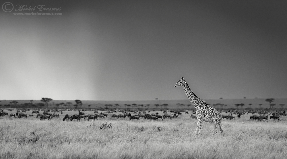
It does scream Maasai Mara . . . Very nice conversion and specially like the rain pouring down in the BG
Registered on January 24, 2012, 163 Posts, 369 Comments
Comment posted by Joe James on November 26, 2014 at 9:00 PM
Both of these are sweet!
Registered on November 20, 2009, 89 Posts, 808 Comments
Comment posted by Balan Vinod on November 27, 2014 at 12:01 PM
Morkel ..both are classic ..no question about that ...well its personal...the shoulder upwards in the BW ..can it be brightened a bit..would it work better that way..?
Balan Vinod
Registered on March 20, 2006, 889 Posts, 2312 Comments
Comment posted by Brad Hill on November 28, 2014 at 9:10 AM
Hi Morkel,
Thanks for providing both versions - as you know I find that very useful...
Have to say that I like both versions, but in pure aesthetic terms I prefer the B&W version slightly more. But that being said, I can see the colour version being preferred and/or used for a number of things. What I'm getting at is that if I had to choose one for a print, then I'd go with the B&W. But I can see some magazines wanting the colour version. So if it were mine I'd offer it up both ways.
Thoughts common to both versions: While a textbook composition (splitting of frame, position of main subject, etc.) and not at all "thinking outside the box" - this one works real well (guess that's why it's become textbook composition, eh?). Lighting is sweet, sky in interesting in a subtle way. Simply a solid, appealing shot - well done.
Cheers...
Brad
Registered on May 29, 2007, 431 Posts, 6061 Comments
Comment posted by Morkel Erasmus on December 1, 2014 at 12:05 AM
Thanks for your comments Brad, Balan and Mario...
Registered on March 22, 2011, 385 Posts, 2068 Comments

Comments
6 commentsThe colour version!
Balan Vinod
Thanks for providing both versions - as you know I find that very useful...
Have to say that I like both versions, but in pure aesthetic terms I prefer the B&W version slightly more. But that being said, I can see the colour version being preferred and/or used for a number of things. What I'm getting at is that if I had to choose one for a print, then I'd go with the B&W. But I can see some magazines wanting the colour version. So if it were mine I'd offer it up both ways.
Thoughts common to both versions: While a textbook composition (splitting of frame, position of main subject, etc.) and not at all "thinking outside the box" - this one works real well (guess that's why it's become textbook composition, eh?). Lighting is sweet, sky in interesting in a subtle way. Simply a solid, appealing shot - well done.
Cheers...
Brad