Gallery: LandscapePosted January 5, 20152,990 views10 comments
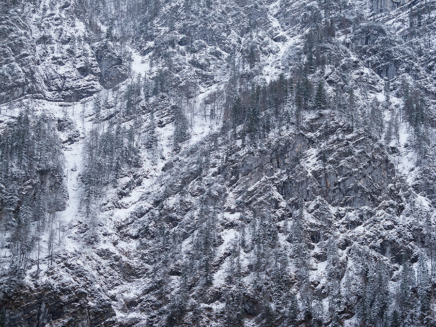
From a trip to Salzkammergut, Styria, last December. The subtlety of the diverse textures was impressive to me.
Comments and critique are appreciated.
Comments
10 comments
Comment posted by Prashant Khapane on January 5, 2015 at 3:35 PM
I know the area quite well Peter. I like the idea here. There are interesting possibilities here if you could bring out bit more contrast.
Registered on November 1, 2003, 492 Posts, 4580 Comments
Comment posted by Peter Richter on January 5, 2015 at 4:46 PM
Thanks for the suggestion. Maybe I was a bit too cautios trying to keep the atmosphere at dusk.
Would be interested to know whether the second version works better.
Peter
Registered on November 10, 2010, 218 Posts, 2723 Comments
Comment posted by Nick Bristol on January 5, 2015 at 5:35 PM
Hi Peter, I like this shot and it almost looks like an aerial. It has a subtle beauty that I'm quite enjoying. I like the gray / blue tones and the textures are very nice. I like the original but do feel the repost works even better. Happy New Year to you and your family! Cheers, Nick
p.s. I spent some time looking through your book over the holidays and enjoy it more every time I look.
Registered on February 1, 2004, 752 Posts, 14140 Comments
Comment posted by Nancy Lea Sandy on January 5, 2015 at 8:18 PM
Certainly a study in textures. Very dramatic and, yes, the re-post is an improvement. Nicely done
Registered on January 24, 2011, 576 Posts, 6942 Comments
Comment posted by Harley Goldman on January 5, 2015 at 9:56 PM
I am thinking I would like to see this in straight B&W with a boost to the contrast in the midtones. I like the concept too.
Registered on November 19, 2003, 586 Posts, 11271 Comments
Comment posted by Kah Kit Yoong on January 6, 2015 at 6:26 AM
I prefer the repost except for the bottom left area where it seems overly dark. Well seen and the textures and patterns are great to explore.
Registered on September 27, 2006, 636 Posts, 10682 Comments
Comment posted by Jared Warren on January 6, 2015 at 3:33 PM
Very nice, Peter. I really like the interesting cross-hatch pattern.
Registered on May 11, 2012, 84 Posts, 931 Comments
Comment posted by Bill Dark on January 6, 2015 at 3:37 PM
Beautiful silver tone and many interesting features to explore in this, Peter. My only suggestion would be to crop the dark area in the lower left corner. Very nice!
Registered on May 27, 2005, 148 Posts, 1121 Comments
Comment posted by Preston Birdwell on January 6, 2015 at 7:31 PM
I like the repost, and I also like the cool blue color palette. A B&W rendition could also be nice. The textures here are nice and detailed.
--P
Registered on November 1, 2003, 471 Posts, 5188 Comments
Comment posted by Eva McDermott on January 9, 2015 at 6:22 PM
Wonderful large scale abstract Peter. I prefer your repost and yes, certainly B&W would be interesting.
Registered on January 4, 2009, 1015 Posts, 13229 Comments

Comments
10 commentsWould be interested to know whether the second version works better.
Peter
p.s. I spent some time looking through your book over the holidays and enjoy it more every time I look.
--P