Nature Photographers Network
This is the preserved archive of the original Nature Photographers Network. The community continues at naturephotographers.network.
Fortress of Solitude
‹ PreviousLandscape GalleryNext ›

Fortress of Solitude

by Harry Lichtman

Gallery: LandscapePosted February 6, 2015338 views13 comments
Thanks for all of the input on the last post.

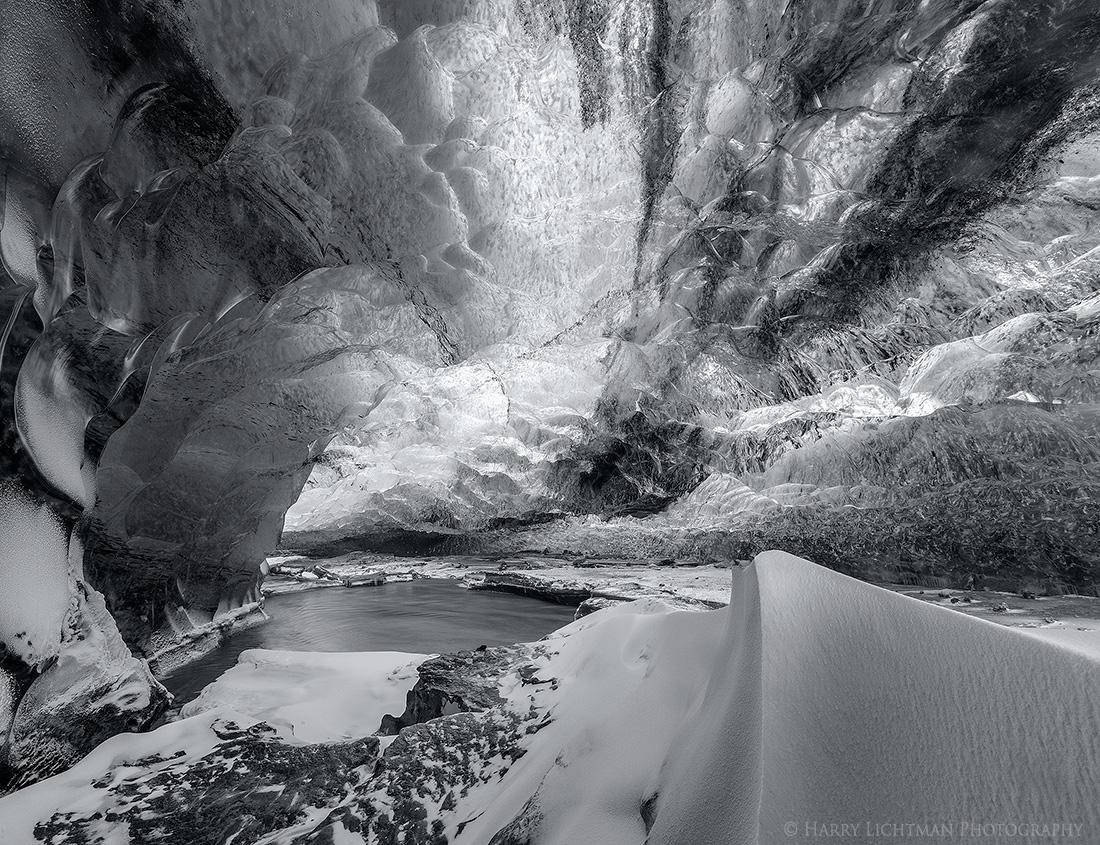
The title comes the Superman movies which I remembered growing up. They ice world looked so wild and cool. This is a simple PS BW conversion from an Iceland ice cave in the Vatnajokull Glacier. I gave it a very slight blue tint as the original conversion looked too brown or yellow. I often apply this slight tint to all of my BW's. I came up with this and my other comps, during the last 10 mins in the cave, as other folks were often in my view. I do like the color version since it was such an unusually blue environment, but it was fun to see what monochrome would do for the image. Your thoughts much appreciated.

Canon 5DII, 16-35, f16, 1.6 sec.

I stitched 2 horizontal images vertically to allow me to capture some of the high parts of the cave's ceiling and get extended DOF.

Comments

13 comments
Comment posted by Chris Chamberlain on February 6, 2015 at 10:32 PM
I am really a color liking person. So I probably would almost always prefer the color versions of most any image. But I do like they way your conversion simplifies this down to the interesting shapes, and the light. I think luminance is a better descriptive word for the light in this. Nice!

Chris
Registered on March 13, 2007, 500 Posts, 8365 Comments
Comment posted by Roel Wijtmans on February 7, 2015 at 2:13 AM
I liked your color version, but I like this one a lot as well, it has a bit more of an abstract feeling to it. But I still think the color in this case is so special that it adds a lot to the image, so I think I prefer that one. Although I really like the dark streak in the ceiling on the right in this version, which was not present in the color version. Whatever, both are great!
Registered on September 30, 2012, 116 Posts, 2257 Comments
Comment posted by Mark Seaver on February 7, 2015 at 9:11 AM
Interesting comparison, Harry. In this version it's much easier for me to see the distance and the textures stand out even better, but I sure like the chilly blueness of the previous post.
Registered on January 23, 2011, 1103 Posts, 17270 Comments
Comment posted by Eva McDermott on February 7, 2015 at 9:49 AM
Wonderful textures and shapes really pop in this B&W version. Love the abstract qualities.
Registered on January 4, 2009, 1015 Posts, 13229 Comments
Comment posted by Harley Goldman on February 7, 2015 at 9:51 AM
Both work really well. Given the subject, I am leaning toward the color version, but this one is also beautiful.
Registered on November 19, 2003, 586 Posts, 11271 Comments
Comment posted by Patricia Brundage on February 7, 2015 at 10:10 AM
In the b&w version I don't know immediately what I'm looking at. In the color version it is obvious. Therefore my preference is the image in color.
Registered on March 23, 2006, 1111 Posts, 6531 Comments
Comment posted by Philip Hodgkins on February 7, 2015 at 11:45 AM
Cool! :cool: A seriously surreal view of the ice cave. I like this better than the color version. :toast:
Registered on July 24, 2006, 2741 Posts, 12349 Comments
Comment posted by Bill Fach on February 7, 2015 at 12:08 PM
Harry: This works for me and I think the conversion is top notch. I do prefer the color for this particular subject but I still like this a lot.>=))>
Registered on November 1, 2003, 1805 Posts, 26981 Comments
Comment posted by Igor Doncov on February 7, 2015 at 1:12 PM
I like this version more than the color version. The B&W looks less like an ice cave and that seems to give me the freedom to simply enjoy the luminous shapes, tones, and textures without trying to 'understand' what I'm looking at. There's a beautiful graphic quality in the left side of the image and the foreground the subtle tonal range of sand dunes. It's a little busy but I enjoyed letting my eyes wander all through the image.
Registered on November 22, 2014, 189 Posts, 2733 Comments
Comment posted by Nick Bristol on February 8, 2015 at 12:27 PM
Harry, I really like this! The tones, shapes and textures are just amazing. It is really cool to just sit back and explore through the large version. Pretty impressive image for me. :smile:

Nick Bristol
Lone Rock, WI
Registered on February 1, 2004, 752 Posts, 14140 Comments
Comment posted by Ryan Shain on February 8, 2015 at 1:24 PM
This is such a cool image to explore Harry. I have yet to comment on the color version, but I love that image. There are so many interesting shapes, lines, and tones, and they are all kind of converging in such funky and beautiful ways. I love the feeling of being encompassed by ice, and the little bit of open water adds a nice change of pace from the rigidness of the rest of the image.

Sweet work
Registered on February 20, 2007, 226 Posts, 4571 Comments
Comment posted by Sandro Bisotti on February 8, 2015 at 5:41 PM
clap hands, clap hands, clap hands!!
One of the most entushiasting image I've seen in the last months (and I'm considered never happy).
Subject, composition, light/exposure management, b/W rendition.....all spectacular.
But the extra among excellent aspects is the subtleness of tone transitions.
Thank you for sharing,
S.
Registered on February 8, 2015, 30 Posts, 265 Comments
Comment posted by Basil Greber on February 10, 2015 at 2:40 PM
I think the shapes and patterns are great. At the same time, I find myself very confused because I have a hard time figuring out the three-dimensional arrangement of elements I'm being shown on the screen. :smile:
Registered on November 8, 2005, 219 Posts, 1340 Comments