
by Tony Kuyper
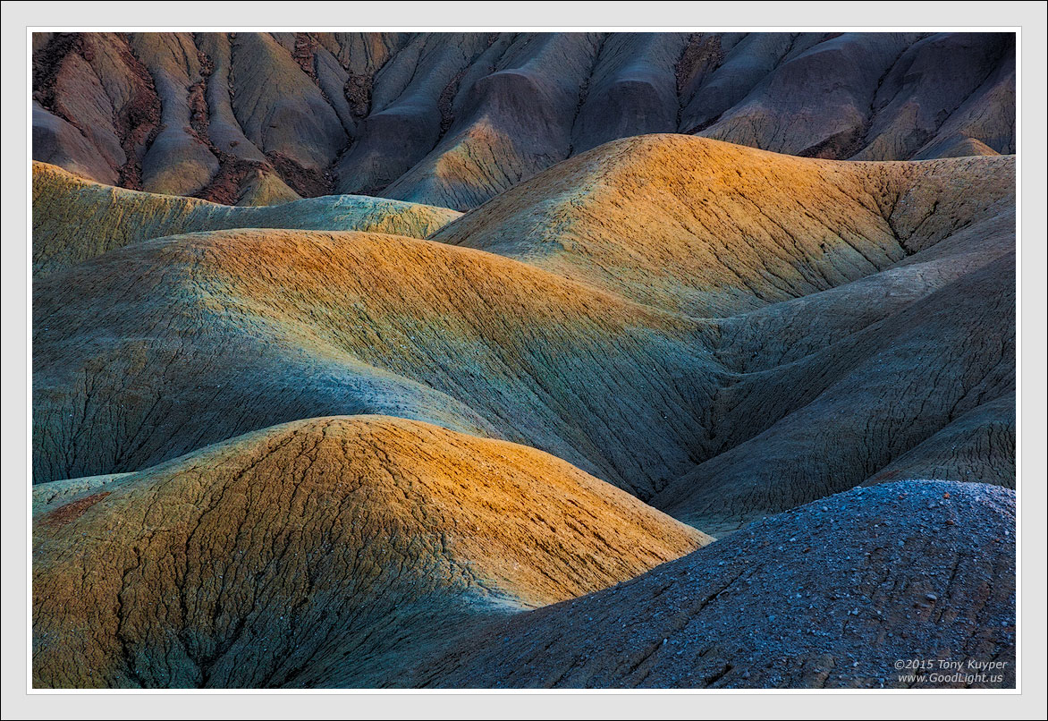
This was taken after sunset when the light holds a lot of mystery. What I see with my eyes, what the camera sees, and what actually develops out are frequently not the same same thing. It's hard, at least for me, to know what the final image will look like just from being there and taking the picture. Usually the soft light does provide a lot of leeway for exploration and I try several different things, but in the end the image seems to determine the path to it's final form.
The unadjusted RAW captured is below with Auto white balance. I think the developed colors have their roots here. I know the saturation is much stronger, but it seems to help create "saturation contrast" between the foreground and backbround elements. Would be interested in other's opinion as to whether this strong of color works or not?
Canon 5D2, 28-300 @ 168, f/16, 15 sec, ISO 400
Comments
23 commentsUnadusted RAW file with Auto white balance.
Tony, the saturation is too strong in my view, although I do like the composition and lighting a lot.
Stunning Tony, once again. You really know how to get the best from these scenes. The soft and very illuminating light is gorgeous.
As to the strength of the colors and such, it certainly is a lot stronger than I would do myself, but that's the great thing about photography, you can add your personal experience to the photo like you did here. Does it look like this in reality? Maybe not. But this is how you experienced it and expressing experiences is also an improtant aspect in photography I think. Otherwise everything would be more or less photojournalism.
Nice sensual curves Tony ! And thank's for posting the raw file - quite the difference to the processed image. For me, the colors are a tad strong, like Roel said - stonger than I would do it myself. But staying objective is impossible as the raw file with the low contrast and low saturation is certainly not a reference either and twilight renders the land into colors that are "unreal" anway.
I lik the mix of warm and cool tones Tony. The detail is splendid too.
Yea, saturation is always going to be a personal opinion. So, my opinion is that the colors are well controlled and not over the top. The extra punch makes this image for me, along with the curves and texture. Well crafted!
I really like the soft light and the composition. The colors are much too saturated for my tastes (why does that not surprise you? ) but I like the direction you took it.
I like how you developed the strong golds contrasting with the blues and muted burgundy backslope. Overal the image has a nice metallic sheen to me. This works for me Tony.
I really like this, Tony. (as usual)
Your minds eye must have hawk like focus to visualize the effects you develop in post. Clearly, artistic mastery few posses or perceive. Your work is never over the top and always inspirational for me. A sense of what might be possible with an image I might otherwise give up on can be credited to your work. I realize it won't appeal to every ones taste, but that is why they make chocolate and vanilla.
Great work as far as I'm concerned!
The strong golds and the variety of subtle blues create some fine eye movement here, Tony. The shape contrast with the darkened top of the frame works well also. This is a lovely image.
I've seen similar changes during processing with some of my water lily images. When the capture is very limited in dynamic range, processing to expand that range brings out lots of color. I often wonder how much of that is Adobe engineers vs how much of that is the camera sensor. It might be interesting to redo an image like this with non-Adobe software, although the level of effort would be very high, which is my excuse for not trying it....
For me, the colors are a little strong because that's the first thing I noticed - not by much though. But then the excellent composition, depth, and contrast of the image took over. The curious thing for me is how the raw file is almost completely devoid of color? I've shot the badlands many times and the purples, blues, and yellows are always very prevalent - especially at twilight.
Anyway, I think the image is fantastic! If it were mine, I would pull back on the saturation just a touch...
When you view an image like this, you just have to remember that it is an artist's rendering of a scene, and not just a straight representation of that scene. I wouldn't necessarily process my photos this way, but I love the image, and it's great to see where it came from to really appreciate the vision and technical execution involved in getting to the final version.
I love the use of complementary colors and, as always, your composition is excellent.
Nice creation Tony. This one looks voluptuous. The colors look like the ones I saw at those Yellowstone Hot Springs. I actually like the original image and with a bit of contrast would have been happy with that. The composition is spot on, as yours always are. Very creative. Don't know how to critique something like this because all is up to the creator.
I love this, Tony. Not only does this transport me to a place that touches my soul, but it does so with an otherworldly feel, that one can experience in the twilight in the badlands. If I had the skill to paint this scene, the colors that you were able to wring from the raw, would be excatly what I put on the canvas. So I'm in the I like what you have here camp. Beautiful work, Tony.
Craig Moreau was saying "When you view an image like this, you just have to remember that it is an artist's rendering of a scene" and I think the samething. For sure the colors are saturated but it's the vision of the artist. The strong colors will bring out details and contrast that force the eyes to run all over the hills. It works for me. I like it.
This is wonderful. I'm not paying any attention to the raw but rather just enjoying the fantastic comp, light and beautiful colors. The details and textures in the large version are a treat. Excellent work Tony! I like it alot.
Nick Bristol
The colors are yummy looking...just like frosted cupcakes... spread a little whip cream on top and get me two to go! Wonderful lighting and processing!
Stunning result. I love the composition and the range of colours.
HI Tony,
You are truly an artist, and photography is your painting canvas. You create wonderful works art, and you can visualize and create beautiful images. My eyes move along this image image wonderfully with your composition, and the contrasts and color tones are great to enjoy on this ride.
Beautiful vision and presentation
I really like this and on my monitor the saturation seems right. It's amazing to see this along with the unadjusted raw file. Nice work!
That is simply stunning. Gorgeous image....though one can say the saturation is way too strong I just love it. You did an axcellent job creating this image
I, for one, like it. Great stuff Tony.
Tony: Truly amazing what you extract from what I might call an underwhelming beginning! As an unrepentant color junkie this really works for me. Marvelous work and congrats on the WP. >=))>