Gallery: LandscapePosted May 25, 2015186 views10 comments
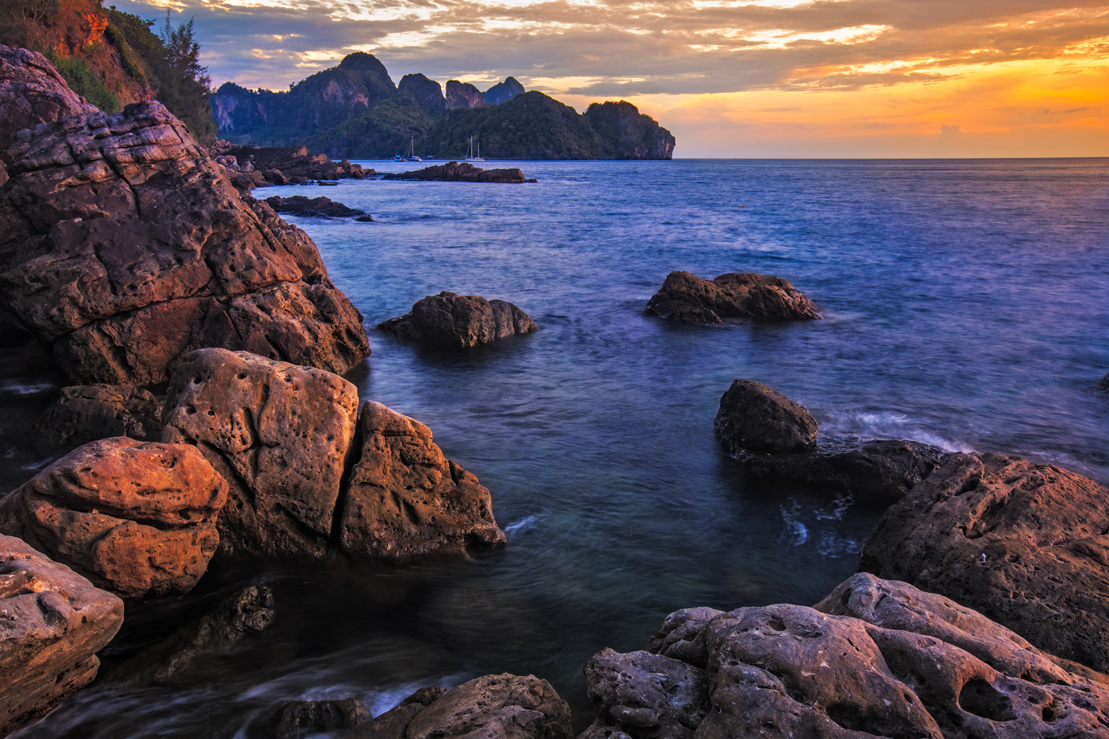
Phi Phi Island in Thailand seen from its northwest coast at sunset. I'm not happy with the Color Balance of the image... What do you think? Any Suggestion? C&C welcome!
EOS 6D, EF16-35mm F2.8 at 27mm
1,3s, F/16 ISO 200
Comments
10 comments
Comment posted by Mark Seaver on May 26, 2015 at 3:55 PM
This is a fine look at a rugged coast. I like the hints of light on the foreground rocks how the view angles nicely to the colored sky in the upper right. In spite of how rugged the coast is, this has a very peaceful feeling.
Registered on January 23, 2011, 1103 Posts, 17270 Comments
Comment posted by Harry Lichtman on May 26, 2015 at 4:07 PM
I'm not seeing any big problems with the overall color balance. The right sky looks quite warm and yellow, while the reflected areas in the water that correspond to that area of the sky appear more magenta, so maybe you worked on color balance independently in the image? Otherwise, lots of nice interest in the rocks and coastline.
Registered on September 17, 2010, 304 Posts, 3507 Comments
Comment posted by gary phillips on May 26, 2015 at 9:15 PM
I don't see any probems with color balance, Lucinei. Beatiful coastal shot. The large really shows this very well. My only suggestion would be to tone down the brightest orange spot upper right. It looks a little hot to me and a bit of an eye magnet. Very nice work.
Registered on October 24, 2013, 185 Posts, 4136 Comments
Comment posted by Jean C Cajolet on May 26, 2015 at 9:35 PM
I don't see a problem with the Color Balance. I like the colors in foreground and the very fine blue reflection on the mountains in the background. Color of the sky is beautiful as well as the rays of light on the stone of the FG. Beautiful Sunset!
Registered on April 28, 2014, 53 Posts, 532 Comments
Comment posted by Roel Wijtmans on May 27, 2015 at 10:50 AM
Color balance looks good to me too. Maybe just a wee bit too saturated, but otherwise I don't see anything wrong with this photo. Looks like a beautiful place!
Registered on September 30, 2012, 116 Posts, 2257 Comments
Comment posted by Igor Doncov on May 28, 2015 at 9:49 PM
I like the color balance pretty much. The more distant sea looks a bit too blue but that's about it. The composition is really great and I really like the sense of water movement down between those rocks. I think you really nailed that. I would clone out those sailboats, though, for this forum.
Registered on November 22, 2014, 189 Posts, 2733 Comments
Comment posted by Richard Teller on May 28, 2015 at 10:40 PM
Very nice light and you captured it very well. The composition works nicely.
Registered on August 23, 2010, 1162 Posts, 6692 Comments
Comment posted by Stephen Stanton on May 29, 2015 at 12:13 AM
Very nice shot, looks like a wondeful location. Some good light on the FG rocks, Lucinei. Color balance wise, I would want to warm up the sea a bit so the white water have less of a blue tint, and the darker cliffs in the BG seem just a bit blue. Nice work.
Registered on March 1, 2015, 54 Posts, 453 Comments
Comment posted by Lucinei Stadnik on May 29, 2015 at 10:47 PM
Thank you everyone for your comments!!! I realy enjoyed them! Here is the new version with the proposed changes.... Clone out those sailboats did made a huge difference as well as tonning down the brightest orange spot upper right + drecreasing saturation, and warming up a little the sea. Thank you once more!!! Open for new opinions!!!
Registered on March 26, 2015, 6 Posts, 7 Comments
Comment posted by Ryan Shain on May 30, 2015 at 3:14 PM
Hi Lucinei,
I rather like the color balance, and the warm and cool tones play beautifully together. This image makes the spirit feel alive and ready for the joys of life. The re-post is fantastic, and excellent work!!!
Registered on February 20, 2007, 226 Posts, 4571 Comments

Comments
10 commentsThis is a fine look at a rugged coast. I like the hints of light on the foreground rocks how the view angles nicely to the colored sky in the upper right. In spite of how rugged the coast is, this has a very peaceful feeling.
I'm not seeing any big problems with the overall color balance. The right sky looks quite warm and yellow, while the reflected areas in the water that correspond to that area of the sky appear more magenta, so maybe you worked on color balance independently in the image? Otherwise, lots of nice interest in the rocks and coastline.
I don't see any probems with color balance, Lucinei. Beatiful coastal shot. The large really shows this very well. My only suggestion would be to tone down the brightest orange spot upper right. It looks a little hot to me and a bit of an eye magnet. Very nice work.
I don't see a problem with the Color Balance. I like the colors in foreground and the very fine blue reflection on the mountains in the background. Color of the sky is beautiful as well as the rays of light on the stone of the FG. Beautiful Sunset!
Color balance looks good to me too. Maybe just a wee bit too saturated, but otherwise I don't see anything wrong with this photo. Looks like a beautiful place!
I like the color balance pretty much. The more distant sea looks a bit too blue but that's about it. The composition is really great and I really like the sense of water movement down between those rocks. I think you really nailed that. I would clone out those sailboats, though, for this forum.
Very nice light and you captured it very well. The composition works nicely.
Very nice shot, looks like a wondeful location. Some good light on the FG rocks, Lucinei. Color balance wise, I would want to warm up the sea a bit so the white water have less of a blue tint, and the darker cliffs in the BG seem just a bit blue. Nice work.
Thank you everyone for your comments!!! I realy enjoyed them! Here is the new version with the proposed changes.... Clone out those sailboats did made a huge difference as well as tonning down the brightest orange spot upper right + drecreasing saturation, and warming up a little the sea. Thank you once more!!! Open for new opinions!!!
Hi Lucinei,
I rather like the color balance, and the warm and cool tones play beautifully together. This image makes the spirit feel alive and ready for the joys of life. The re-post is fantastic, and excellent work!!!