
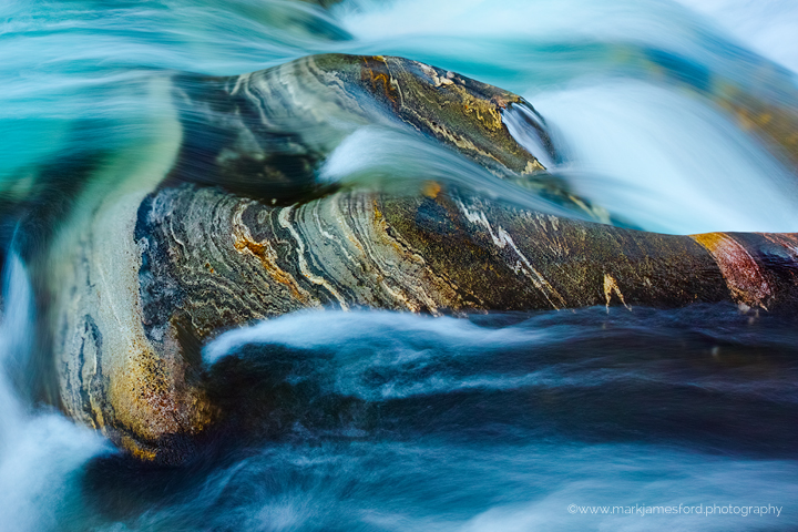
Here a detail shot from Verzasca, Switzerland - Whilst the water and rocks do display extremely interesting colours and textures, clearly, the colours in the water here, have been somewhat enhanced in this interpretation.
Sigma DP2 Quattro, F10, 1 sec., ISO 100
A large version of the image can be viewed HERE.
Mark

Comments
5 commentsThis is a great abstract, Mark. I like the blue color cast in the water and how the lines in the rock go the opposite direction of the water flow.
Fascinating "realistic abstract" with both a soothing flow and sharp details. I like your decision to augment the color of the water.
Beautiful. This is a case where the rock is actually move attractive than the water itself. The rock striations work well with the water because they add to the sense of movement. I think a slightly faster shutter speed would have added to the sense of motion that this image is creating. The water would have more swirls and less of a foggy look. Nice job. The browns contrast nicely with the blues.I find the far right cimarron colored part of the rock a bit distracting. A crop from the right seems to have a more pleasing composition.
I love the combination of the water flow and rock striations. The orthogonal flow of the water to the striations in the rock add a nice tension to the scene. The only thing I might change is to burn down the bright water in the upper right hand corner ever so slightly.
Hi, thanks for comments and compliments - much appreciated!
@Igor, I can see your point (thanks) with the cimarron on the far right and will probably go back and look at this again - I think the 5:4 crop might well work though it does loose some of the dynamic. Of course, it would also address the point below ...
@Eva, yes I think on reflection you have a point here, pulling the top right corner back just a touch will bring a liitle bit to the balance of the picture - thanks
Cheers, Mark