Nature Photographers Network
This is the preserved archive of the original Nature Photographers Network. The community continues at naturephotographers.network.
Winter Comes to the Pond
‹ PreviousLandscape GalleryNext ›

Winter Comes to the Pond

by Jim Fairman

Gallery: LandscapePosted December 4, 2015134 views8 comments
taken w/Canon EOS 7D w/Canon 18-55mm IS STM
settings:      Aperature priority   f/11 1/2000  ISO 800 18mm  spot metering

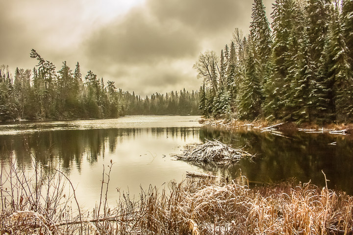
The sun had just popped behind some cloud cover but was still quite bright and snow flurries began in the distant trees.
I like the starkness of the foreground contrasted with the softness of the distant trees, with the stillness of the pond reflecting a bit of both.

Any comments and suggestions as usual are welcome and appreciated.

Comments

8 comments
Comment posted by Tony Kuyper on December 4, 2015 at 9:21 PM
The muted warm colors certainly create a unique photographic interpretation.  The comp maybe feels a little unbalanced (heavier on the right) but the muted warm colors evens things out.
Registered on November 1, 2003, 364 Posts, 22328 Comments
Comment posted by Roel Wijtmans on December 5, 2015 at 9:26 AM
I am a bit on the fence about the bright white spot in the sky, since it doesn't really fit in with the rest of the photo. But that's a small nit to be fair! You captured some great late autumn feeling here, with the fresh snow, and I really like this. Comp works fine for me.
Registered on September 30, 2012, 116 Posts, 2257 Comments
Comment posted by Jim Greenwood on December 5, 2015 at 9:33 AM
Now this one I like!  I have to admit that the few other images that you have posted to this gallery so far weren't so appealing to me personally.  But this composition is much better.  It has a nice wintery mood to it.  I'd only suggest trying to do a highlights adjustment to minimize the hot spot in the clouds along the top border.  Welcome to NPN!
Registered on November 9, 2003, 229 Posts, 1523 Comments
Comment posted by Lon Overacker on December 5, 2015 at 1:00 PM
Jim,

This is your best so far!  this is wonderful!  I really like the warm tones contrasted with the obvious cold atmosphere.

I can see the comments regarding the bright cloud up top and you might do well to address that, but it's not bothering me all that much - after all, it is the sun peeking through.  

Well done, I like this one a LOT!

Lon
Registered on November 24, 2006, 521 Posts, 19147 Comments
Comment posted by gary phillips on December 5, 2015 at 1:59 PM
This is very nice, Jim.  I also think this could make a killer B/W if you were to try a conversion. The highlights don't bother me at all.
Registered on October 24, 2013, 185 Posts, 4136 Comments
Comment posted by Preston Birdwell on December 5, 2015 at 7:50 PM
I like the high key presentation. The bright spot at the top is a liitle hot, but that's minor. I like the warm tones and the quiet mood.

--P
Registered on November 1, 2003, 471 Posts, 5188 Comments
Comment posted by Bruce King on December 6, 2015 at 2:37 PM
Really like the subdued colors and the almost high key approach. It seems slightly tilted to the left but I'm guessing it's probably not...possibly the curving shorelines make it appear so. The bright spot could be knocked down a little but it's definitely not a deal breaker...nice shot.
Registered on January 14, 2010, 276 Posts, 2212 Comments
Comment posted by Albert Darmo on December 7, 2015 at 9:41 PM
Hi  Jim  crying       Nice enough to  make  a  post card.   the soft warm  tones and  the beautiful scenery   invite  a tranquil mood .


Albert   Darmo
Canada
Registered on November 25, 2008, 1386 Posts, 11978 Comments