Gallery: LandscapePosted December 7, 2015634 views18 comments
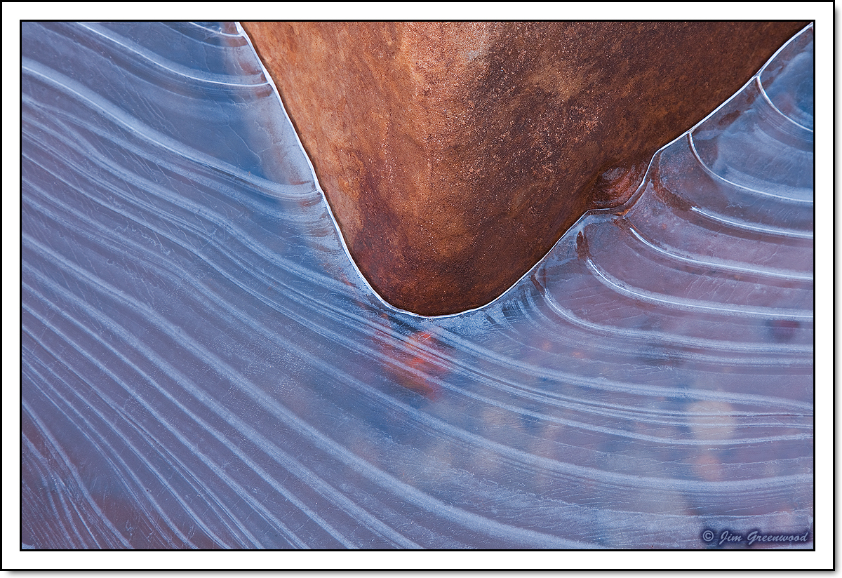
The scale of this image can be judged by the small stones and pebbles barely visible under the ice in the lower right quadrant.
Canon 5D II
Canon 24-105mm f/4L IS
93mm, f/16, 0.8 seconds, ISO 50
Comments
18 comments
Comment posted by Balan Vinod on December 8, 2015 at 12:31 AM
Jim ..your series on abstrasct patterns in Ice is fantastic. This one is quite simple and effective with just two colours. Nice to be printed and hung on the wall.
Balan Vinod
Registered on March 20, 2006, 889 Posts, 2312 Comments
Comment posted by Lon Overacker on December 8, 2015 at 3:08 AM
Jim,
I commented earlier on another post, simple is almost always better. Clearly, this simple, yet the bold composition is very strong; I'd say stronger than your previous post. That's not to say that your previous image wasn't beautiful and compelling... but this image makes a statement. Strong, bold and beautiful. No nits or suggestions.
You're on a roll in Zion.
Lon
Registered on November 24, 2006, 521 Posts, 19147 Comments
Comment posted by Prashant Khapane on December 8, 2015 at 5:46 AM
very very nice abstract. Beautiful shapes!
Registered on November 1, 2003, 492 Posts, 4580 Comments
Comment posted by Richard Sandor on December 8, 2015 at 10:20 AM
Jim: this is an excellent example of less is more. Two tones, two textures and two shapes make it compellilng. Richard
Registered on January 12, 2014, 453 Posts, 1625 Comments
Comment posted by Roel Wijtmans on December 8, 2015 at 11:27 AM
Very nice, again! This reminds me of a boat pushing through the water.
Registered on September 30, 2012, 116 Posts, 2257 Comments
Comment posted by Marylynne Diggs on December 8, 2015 at 12:07 PM
This is gorgeous. I love the shape of the rock and the contrasting lines in the ice. I even like the hint of rocks beneath the ice. This is really wonderful.
Registered on December 14, 2010, 122 Posts, 1034 Comments
Comment posted by Igor Hoveijn on December 8, 2015 at 3:30 PM
This one is certainly not chaotic. Again the beautiful warm cold colour contrast. The silver lining of the ice where it touches the rock is very nice. I really like it, although I am not sure whether the boundary of ice and rock should end in the urc. But that is just personal.
Registered on November 2, 2015, 18 Posts, 192 Comments
Comment posted by Kah Kit Yoong on December 8, 2015 at 4:39 PM
Love the cool warm contrasts and the patterns in the ice. A beautiful abstract.
Registered on September 27, 2006, 636 Posts, 10682 Comments
Comment posted by David Schoen on December 8, 2015 at 4:50 PM
This is my favorite of the series so far. It has two prominent tones and two different sets of color and shapes.
Registered on November 6, 2006, 1213 Posts, 4587 Comments
Comment posted by Tony Kuyper on December 8, 2015 at 8:26 PM
Very strong comp, JIm. Really like the simple strength in this one.
Registered on November 1, 2003, 364 Posts, 22328 Comments
Comment posted by gary phillips on December 8, 2015 at 9:02 PM
Really sweet Jim. Very cool color combo and a simple and powerful comp. If I could suggest anything, it would have been to move the point of the rock a little further right, not much just a little.
Registered on October 24, 2013, 185 Posts, 4136 Comments
Comment posted by Chris Chamberlain on December 8, 2015 at 10:16 PM
Very clean, and unusual image. The color is great! Your web sharpening is really good!
Registered on March 13, 2007, 500 Posts, 8365 Comments
Comment posted by Albert Darmo on December 8, 2015 at 10:31 PM
Hi Jim I too have enjoyed your icescape series.. ...I. love the bold lines and colors. of this fine abstract ..
Albert Darmo
Canada
Registered on November 25, 2008, 1386 Posts, 11978 Comments
Comment posted by Stephen Stanton on December 9, 2015 at 1:59 AM
Very fine one of your best, Jim. Like the rest have written; colors, lines, simplicity...equals strength.
Registered on March 1, 2015, 54 Posts, 453 Comments
Comment posted by Mark Seaver on December 9, 2015 at 1:49 PM
Jim, this is a lovely combination of flowing lines, shapes, and colors. The triangle of warm rock makes a fine contrast to the chilly lines in the ice.
Registered on January 23, 2011, 1103 Posts, 17270 Comments
Comment posted by Ed Lowe on December 9, 2015 at 3:19 PM
What a great find, David. I love the contrasts here; the warm and cool colors and the graceful lines in the ice against tthe hard lines of the stone. Great work.
Ed
Registered on February 7, 2004, 414 Posts, 7115 Comments
Comment posted by Ryan Shain on December 9, 2015 at 10:36 PM
Hi Jim,
Love the flow of the ice lines and the triangle of warm sandstone really brings a nice contrast of color to the cool ice. The intimate view really works to concentrate ones view on the lines,textures, colors, and details. Some beautiful work in photography.
Registered on February 20, 2007, 226 Posts, 4571 Comments
Comment posted by Mark Metternich on December 13, 2015 at 2:35 PM
Wow, love this!
Registered on June 19, 2009, 276 Posts, 6240 Comments

Comments
18 commentsBalan Vinod
I commented earlier on another post, simple is almost always better. Clearly, this simple, yet the bold composition is very strong; I'd say stronger than your previous post. That's not to say that your previous image wasn't beautiful and compelling... but this image makes a statement. Strong, bold and beautiful. No nits or suggestions.
You're on a roll in Zion.
Lon
Albert Darmo
Canada
Ed
Love the flow of the ice lines and the triangle of warm sandstone really brings a nice contrast of color to the cool ice. The intimate view really works to concentrate ones view on the lines,textures, colors, and details. Some beautiful work in photography.