Nature Photographers Network
This is the preserved archive of the original Nature Photographers Network. The community continues at naturephotographers.network.
Outcrops
‹ PreviousLandscape GalleryNext ›

Outcrops

by D.A. Edwards

Gallery: LandscapePosted February 2, 2016122 views8 comments
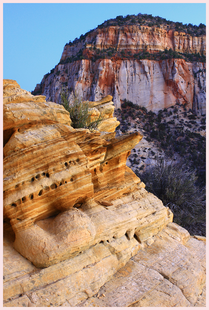
This might have been good for that rock outcrop WC a few weeks ago. Behind Checkerboard Mesa in Zion NP, we camped on the rock on top of this outcrop which had this fascinating little peaklet full of honey-combed sandstone. (I'll post a bit of that over in the Close-up gallery.) This was after sunrise with the sun behind some clouds. I liked all of the diagonals in different colors.

Comments

8 comments
Comment posted by Daniel Rappaport on February 2, 2016 at 3:52 PM
Well composed.  Nice interplay between the close stripes and far. 
Registered on September 9, 2009, 294 Posts, 2006 Comments
Comment posted by Dave Dillemuth on February 2, 2016 at 4:14 PM
Dave,
Well seen and constructed composition. I find the color palate and textures appealing. Not sure if this a compression issue but the back mountainside looks a little soft on my monitor. 
Registered on December 10, 2015, 104 Posts, 1112 Comments
Comment posted by D.A. Edwards on February 2, 2016 at 6:46 PM
I agree David that the BG mountain is a little soft. I generally am not fussed by things that far away needing to be tack sharp as long as the FG subject matter at a few feet away is adequately sharp. Probably due to seeing the world through 60+ year old, near-sighted eyes.

In fact it wouldn't bother me I had produced an image here where the BG was even slightly more OOF. Just a personal thing, YMMV of course and I love your images with their impeccable sharpness throughout.
Registered on October 8, 2014, 226 Posts, 1187 Comments
Comment posted by Ed Lowe on February 2, 2016 at 9:12 PM
I too like the diagonal bands of color in this scene, Dave. Looks like a great place to camp. My only suggestion would be to dial the cyan back a touch.

Ed
Registered on February 7, 2004, 414 Posts, 7115 Comments
Comment posted by Harley Goldman on February 2, 2016 at 9:15 PM
Nice tension between the fore and back, but I am not sure this one is working for me.  I can't quite describe it, but it almost feels to me like the front and back are from two different images. That probably doesn't make much sense, but I can't quite articulate it better. 
Registered on November 19, 2003, 586 Posts, 11271 Comments
Comment posted by gary phillips on February 3, 2016 at 1:25 AM
Looks like a nice place to camp Dave.  I Ike the image a lot although the suggestion to reduce to cyan a little might be worth a shot. The color cast between the fore and back grounds due look to be a little at odds, but the light in Zion can be pretty amazing.
Registered on October 24, 2013, 185 Posts, 4136 Comments
Comment posted by Igor Doncov on February 3, 2016 at 3:38 AM
I agree with Harley's observation about the appearance of superimposition of one subject over the other. I think that's because there isn't a continuum between the two. Your idea of having the background more oof would resolve that by telling the viewer what's more important. 
Registered on November 22, 2014, 189 Posts, 2733 Comments
Comment posted by Roel Wijtmans on February 6, 2016 at 11:26 AM
Bit of an unusual comp, which works great for me! The two colors of rock works nice together, and the clear blue sky makes sure that the desert feeling is there.
Registered on September 30, 2012, 116 Posts, 2257 Comments