Breeching Time (+colour repost)
by Kah Kit Yoong
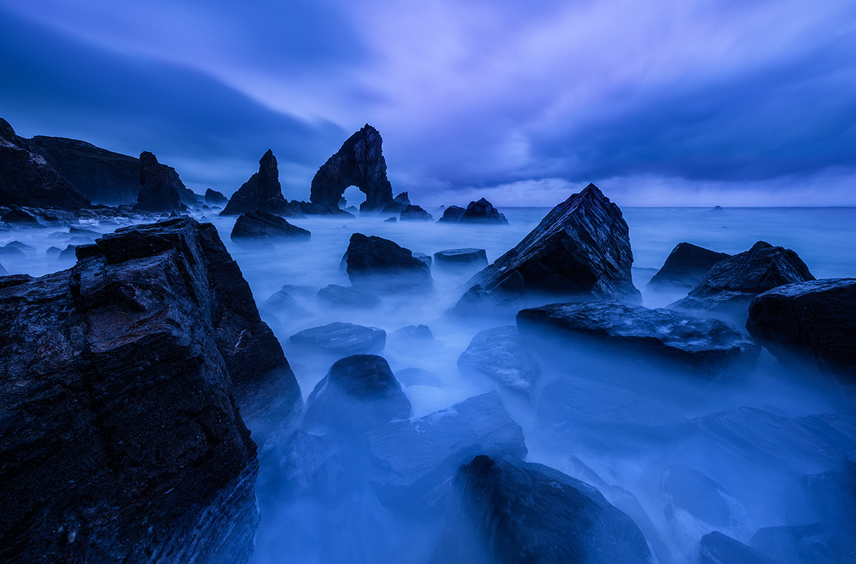
So this was the scene I was shooting before turning around to make the previous image I posted here. As you can see this is a wild and very impressive coastal location, an almost perfect triangular sea arch pretty much hidden from view in Donegal, Ireland. Had lots of luck again here since it was grey and pouring with rain as usual when I arrived for sunrise. All the bad weather started to clear as soon as I started shooting and this was one of the first exposures I made that day. I've really struggled with all the images from this set, in general getting the colours right since I changed from Canon to Nikon has been a pain. My personal preference is for the BW version but very interested to see your reponses.

Comments
19 comments--P
I love the combination of drama and surreal, most especially in the b&w version. The contrast and tonal range are excellent
The color version is dramatic and works well also. For some reason though, I just get the feeling of Velvia's classic color cast in so many situations. Not sure if that's what you're referring to when referencing color between Nikon and Canon. With RAW files, isn't there a broad range of possibilities and interpretations anyway? I'm wondering what, if any, differences would be between the two brands. (but that is coming from a rookie dslr guy...)
Regardless, a dramatic, moody and well composed seascape.
Lon
Then I saw the B&W version, and knew that it was a most excellent interpretation of this impressive landscape. Obviously it has no distracting color issues, but the tones seem to work better, including how the long exposure treats the foreground details.
I think the color version could be just as good if you manage to tame those blues.
ML
Nick Bristol
Lone Rock, WI