Nature Photographers Network
This is the preserved archive of the original Nature Photographers Network. The community continues at naturephotographers.network.
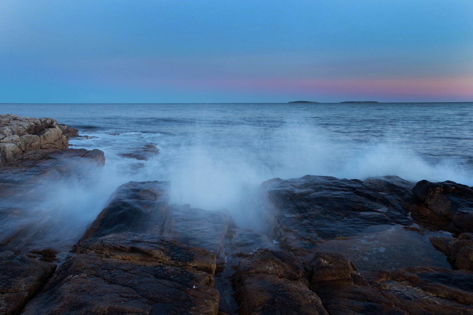
Seawall Twilight + repost
‹ PreviousLandscape GalleryNext ›

Seawall Twilight + repost

by Ed Lowe

Gallery: LandscapePosted November 15, 2016182 views7 comments
Nikon D 800
Nikon 17-35 @ 30 mm
f 18 @ 0.8 sec.
ISO 200
tripod & cable release
Acadia NP, ME

I have been sitting on the fence with this one. I had hoped for a little more color in the sky along with some better wave action, but this is the best I could come up with. I'd appreciate your thoughts on this image.

Ed

Comments

7 comments
Comment posted by Mark Seaver on November 15, 2016 at 9:37 PM
Ed, this is a very pleasant scene, with the nicely misty splashes and some fine gentle colors in the sky.  I do think it's a bit too blue, which is a human visual psychology effect more so than a camera/software issue.
Registered on January 23, 2011, 1103 Posts, 17270 Comments
Comment posted by scott lanz on November 15, 2016 at 10:48 PM
This is nice, Ed. Tranquil because of the blue color, but with some energy with the breaking waves. If you want to go less tranquil, I agree with Mark about reducing the blue. Depends on the mood you're after. 
Registered on November 14, 2003, 840 Posts, 12902 Comments
Comment posted by John Williams on November 15, 2016 at 11:00 PM
This is an interesting one for me Ed. I love the idea, but agree that more sky color would make it more eye pleasing. I'd also prefer slightly more detail in the splashes. Even so though, I'm really enjoying this, especially in the larger version. The waves really make this scene.
Registered on September 6, 2007, 221 Posts, 5985 Comments
Comment posted by Lon Overacker on November 15, 2016 at 11:46 PM
Ed,

I really like the color in the sky.  I think maybe you meant more sunset colors? but I really like the narrow strip of pinks/purples, surrounding by the twilight blues. I don't think this needs more color. ;-)

And I think the wave action is appropriate for the almost quiet oceanscape.  If anything, you might consider a slight crop of either: the sky or the rock at the bottom, to emphasis the opposite feature.  In other words, a little crop from the bottom, helps emphasis the sky and color, where as a crop from the top, emphasizes the rock and wave action below.  Also, I think a more pano crop works because of the long horizon.

Lon
Registered on November 24, 2006, 521 Posts, 19147 Comments
Comment posted by Harley Goldman on November 16, 2016 at 10:10 AM
Really like the sky and the color gradient. The foreground looks a bit on the blue side for me. I like Lon's suggestion of a bottom crop and I would clone out the bright spot in the foreground. Very soothing image. 
Registered on November 19, 2003, 586 Posts, 11271 Comments
Comment posted by Nick Bristol on November 16, 2016 at 11:53 AM
Ed, I like the sky in this just as it is. Sometimes just a little soft color works great as it does here. This image has a very nice feel to me.

Nick Bristol
Lone Rock, WI.
Registered on February 1, 2004, 752 Posts, 14140 Comments
Comment posted by Ed Lowe on November 16, 2016 at 1:49 PM
Thanks for your thoughts everyone. I have cropped the image to make it more of a pano, cloned out the bright spot and reduced the cyan 20 points. I think this works better.
Registered on February 7, 2004, 414 Posts, 7115 Comments