Gallery: LandscapePosted December 14, 20163,787 views19 comments
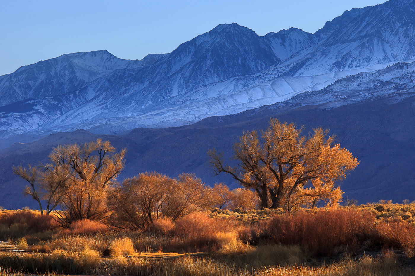
I finally got around to processing this file from earlier this year. This image was taken in the Eastern Sierra near Bishop. Comments, suggestions and critiques appreciated.
5D2, 70-200 f/4 IS L @ 200mm
Comments
19 comments
Comment posted by Dan Kearl on December 14, 2016 at 9:26 PM
To be honest, I would have to say the contrast for me is a bit much. That being said, the FG is absolutely gorgeous.....and the BG is very nice also...
Registered on September 2, 2013, 209 Posts, 1514 Comments
Comment posted by Genny K. on December 15, 2016 at 1:27 AM
Yeah, that FG is gorgeous. There is so much detail, and the lighting is great. I like the way the colors in the FG and BG work together, sort of a version of the classic yellow and blue. And I can believe it would look like this, since you're looking at the shaded side of the mountains, although I can understand people thinking it might be contrasty. It is probably just me, but it looks like the very top of the mountains is darker than lower down.
I like it though; it feels real.
Registered on June 5, 2006, 132 Posts, 2001 Comments
Comment posted by scott lanz on December 15, 2016 at 7:04 AM
Beautiful image, Dave. I like this a lot. I like the strong contrast between the orange colors in the foreground and the blue mountains and sky. I think the processing is right on the edge with regard to the colors, but in a good way. I also like the comp with the trees framed against the mountains and the way you were able to maintain so much detail in the mountains.
Registered on November 14, 2003, 840 Posts, 12902 Comments
Comment posted by Mark Seaver on December 15, 2016 at 8:58 AM
The warm on cool looks great, Dave. Looks realistic to me.
Registered on January 23, 2011, 1103 Posts, 17270 Comments
Comment posted by Ed Lowe on December 15, 2016 at 11:11 AM
The contrasting colors of the warm toned FG against the cool ones of the mountains make for a gorgeous image, Dave. Everything looks very realistic to me. My only suggestion; and this is just a personal preference; would be to clone the bright area in the LLC as it draws my eye away from all the rest of the beautiful elements in the scene.
Ed
Registered on February 7, 2004, 414 Posts, 7115 Comments
Comment posted by Lon Overacker on December 15, 2016 at 11:19 AM
Dave,
This is a wonderful combination of the warm and cool colors and tones. The late light is warm and beautiful. I think the contrast is right on and appropriate.
To get real picky, my eye is drawn to the LLC corner with some of the golden grasses creeping in on the frame. No biggie really, but if you ever print, you might consider dealing with it; especially the bright vertical piece on the bottom left edge.
Beautiful imagery!
Lon
Registered on November 24, 2006, 521 Posts, 19147 Comments
Comment posted by Craig Moreau on December 15, 2016 at 11:26 AM
Dave, I love the light and the color combination. I agree about the tops of the mountains looking darker, and I would crop or clone the bright stuff in the LLC.
Registered on April 21, 2015, 64 Posts, 584 Comments
Comment posted by Preston Birdwell on December 15, 2016 at 11:26 AM
Real nice, Dave. This looks the way the Sierra would be in the late afternoon. I think the contrast is fine, and I love warm/cool color palette. I agree with Lon about that bit in the lower left corner.
Is the main peak Mount Williamson? That thing sure is big!
--P
Registered on November 1, 2003, 471 Posts, 5188 Comments
Comment posted by Marylynne Diggs on December 15, 2016 at 12:22 PM
I really like this, Dave. As others have noted, the cool bg, warm fg works great. The grasses bottom left are a distraction to me too (there might even been part of a road, guardrail there?) I can imagine that very bright center patch before the trees being burned down just a tish as well. Really lovely regardless.
ML
Registered on December 14, 2010, 122 Posts, 1034 Comments
Comment posted by Mattia Oliviero on December 15, 2016 at 2:51 PM
Very nice image, Dave. Love the contrast between shadow and light. Maybe I think that you can slightly reduce the blue dominant on the mountains especially on the snow.
Registered on August 24, 2016, 43 Posts, 254 Comments
Comment posted by Morkel Erasmus on December 15, 2016 at 2:56 PM
the layers and colour contrasts here are outstanding
Registered on March 22, 2011, 385 Posts, 2068 Comments
Comment posted by Dave Dillemuth on December 15, 2016 at 3:15 PM
Thanks for the feedback and suggestions. Here's a revised version incorporating much of the input. I've also added a touch of Orton to the foliage.
Preston,
This is near Bishop so while I'm not sure what mountain this is, it is not Williamson.
Registered on December 10, 2015, 104 Posts, 1112 Comments
Comment posted by Lon Overacker on December 15, 2016 at 5:51 PM
Awesome Dave! Great job on the repost and thanks for taking the time.
Registered on November 24, 2006, 521 Posts, 19147 Comments
Comment posted by Preston Birdwell on December 15, 2016 at 6:02 PM
The repost looks great, Dave.
Duh, I missed the 'near Bishop' part, so yeah, that cannot be Williamson. Whatever it is, it sure is big!
-P
Registered on November 1, 2003, 471 Posts, 5188 Comments
Comment posted by Nick Bristol on December 15, 2016 at 7:19 PM
Dave, This is wonderful! As mentioned the warm cool contrast is a really nice effect here, and I love the way it looks. The blue of the background mountains looks so cool with the beautiful golden color and light on the foreground grass and trees. The repost is even better and works nice with the Orton effect and would probably work fine without it too. Really nice work on this! I like it alot!
Nick Bristol
Lone Rock, WI.
Registered on February 1, 2004, 752 Posts, 14140 Comments
Comment posted by Igor Doncov on December 15, 2016 at 8:25 PM
The repost looks really interesting. I like the orton effect in the bushes; the seem to flow into one another. I think its wise to keep the trees sharp, however. My first reaction to this image was to wish it was a bit more yellowish as opposed to orange. Don't know how that would actuallly look.
Registered on November 22, 2014, 189 Posts, 2733 Comments
Comment posted by Harley Goldman on December 16, 2016 at 5:06 PM
Beautiful. Love the warm and cool tones. The repost is the ticket. I just tore up my nit list. :)
Registered on November 19, 2003, 586 Posts, 11271 Comments
Comment posted by Vance Gese on December 16, 2016 at 8:05 PM
Love the interaction of gold and blue, and how the darker blue background makes those glorious golden trees and grasses glow with an inner light. Your repost is amazing.
Registered on November 13, 2008, 298 Posts, 6629 Comments
Comment posted by Jim Zablotny on December 17, 2016 at 2:14 PM
Hi Dave--Color palate is wonderful. Repost is ideal and this will be a fine print for the wall........................Jim
Registered on January 17, 2004, 705 Posts, 3594 Comments

Comments
19 commentsI like it though; it feels real.
Ed
This is a wonderful combination of the warm and cool colors and tones. The late light is warm and beautiful. I think the contrast is right on and appropriate.
To get real picky, my eye is drawn to the LLC corner with some of the golden grasses creeping in on the frame. No biggie really, but if you ever print, you might consider dealing with it; especially the bright vertical piece on the bottom left edge.
Beautiful imagery!
Lon
Is the main peak Mount Williamson? That thing sure is big!
--P
ML
Preston,
This is near Bishop so while I'm not sure what mountain this is, it is not Williamson.
Duh, I missed the 'near Bishop' part, so yeah, that cannot be Williamson. Whatever it is, it sure is big!
-P
Nick Bristol
Lone Rock, WI.