Nature Photographers Network
This is the preserved archive of the original Nature Photographers Network. The community continues at naturephotographers.network.
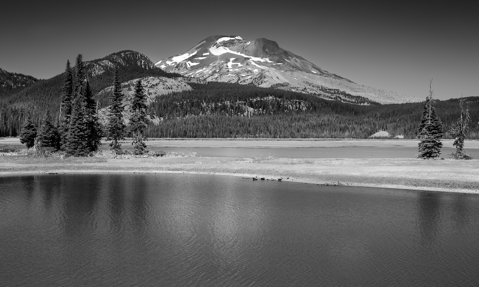
South Sister Sparks
‹ PreviousLandscape GalleryNext ›

South Sister Sparks

by Marylynne Diggs

Gallery: LandscapePosted December 22, 20161,750 views8 comments
Hi Folks,
Here is another black and white conversion from my day at Sparks Lake in August.  I'm finding more and more of these that I want to convert (well, maybe just two more), so I'll share them here over the next week or so. I hope they don't become boring to you, but if they do, please say so.  Feel free, over time, to let me know which ones you prefer from the set.  I will make sure they all stay in my gallery.

This is from a position to the right of the last image from this general location.  I wanted to keep the trees from intersecting the mountain.  The wind prevented perfect reflections, but it was a hot day and the breeze was welcome for that reason.

Processed in Nik and LR

Feedback, suggestions, and yawns all welcome.
ML

Comments

8 comments
Comment posted by Lon Overacker on December 22, 2016 at 4:49 PM
Very nice Marylynne.  I really like the composition and how you used the pines to frame the mountain. This works very well.

A couple of observations.  I'm guessing you used a grad ND and maybe even a CPL too?  The use of the grad (or processing) isn't really that noticeable - except for the grouping of trees on the left where they are considerably darker up top. Not a bad thing per se, just something that caught my eye.  Also, the sky looks like a wide vignette. Actually it's a rather nice affect in the large view.

Other than that, I see a potential pano crop taking some off the water.  Yes, there is a reflection, but not the more important part of the image.  Maybe just enough without cropping in to the reflected trees.

Lon
Registered on November 24, 2006, 521 Posts, 19147 Comments
Comment posted by Genny K. on December 22, 2016 at 8:21 PM
I agree with Lon; I like the overall image, but like him, I would consider a crop off the bottom.  Even though the reflections go way down towards the bottom of the image, I don't think those reflections are strong enough to warrant keeping that extra space.
I think the power of this image would be for someone who knows this mountain, and in that case, this works well as a good portrait.
Registered on June 5, 2006, 132 Posts, 2001 Comments
Comment posted by Harry Lichtman on December 23, 2016 at 8:15 AM
I find the conversion very nice, but not so sure about the composition as a whole.  Seems very static and not a whole lot of drama, which I guess I expect in BW as color isn't an eye grabber.  Difficult without clouds, which give more interest in the sky and perhaps shadows across the land areas.  Maybe too much FG water for me , so maybe a pano crop would improve things.  Some abrupt transitions in the sky as well, not sure if a polarizer was used or if it was introduced during processing - just looks a little un-natural.  So it looks like a very nice view, just not sure these lighting conditions make for the best image.  I think you did well with what you were handed.

I guess my comments might be a little repetitive - didn't read above prior.  Whoops.
Registered on September 17, 2010, 304 Posts, 3507 Comments
Comment posted by Mark Seaver on December 23, 2016 at 3:53 PM
This looks great in b&w, Marylynne.  The ripples in the water add well in the larger version and the textures in the mountain balance well with the water.
Registered on January 23, 2011, 1103 Posts, 17270 Comments
Comment posted by Marylynne Diggs on December 23, 2016 at 9:51 PM
Thanks everyone.  I think I used a gradient filter on the sky before converting.  I noticed the darker tree tops and couldn't quite dial it back after the conversion, but I can always add lightening there or return to the color version. It sounds like the comp doesn't really warrant the additional effort, and that's always good to know.

The composition isn't as interesting as the last one with the s-curve in the shoreline.  I have one in Man and Nature that I think works better...wide pano with adjacent mountain.  I think I have just one more to play with.

Thanks for thoughts.
ML
Registered on December 14, 2010, 122 Posts, 1034 Comments
Comment posted by Brian Schrayer on December 24, 2016 at 12:25 AM
This is definitely a beautiful view and I can't imagine that I could grow tired of it.  There is definitely a strong vignette in the sky (maybe due to a polarizer?).  For my tastes I would recommend evening out the sky a bit.  I definitely prefer the foreground from your previous.  The foreground here just feels a bit static because the lake shore is lacking much in the way of interesting lines.  Other than the vignette your B&W processing looks good.
Registered on May 28, 2004, 114 Posts, 2890 Comments
Comment posted by David Schoen on December 26, 2016 at 2:44 PM
I agree with a lot of the other suggestions and feel that cutting off the bottom quarter would strengthen the composition by making it panoramic.
Registered on November 6, 2006, 1213 Posts, 4587 Comments
Comment posted by Marylynne Diggs on December 27, 2016 at 6:09 PM
Thanks everyone.  I think I figured out the sky issue: it's a combination of noise reduction that had a -20 in shadows remaining from a previous edit.  It also is my use of the Red filter and then some sensitivity sliders in Nik, which combine to emphasize the tonal range in the sky more than necessary or appropriate.  I'm working on fixing that in my workflow.  Sometimes, alas, I forget all that I did!

That said, I've moved on to better compositions.
Registered on December 14, 2010, 122 Posts, 1034 Comments