Nature Photographers Network
This is the preserved archive of the original Nature Photographers Network. The community continues at naturephotographers.network.
The Portal (alt)
‹ PreviousLandscape GalleryNext ›

The Portal (alt)

by scott lanz

Gallery: LandscapePosted June 29, 20178,662 views11 comments
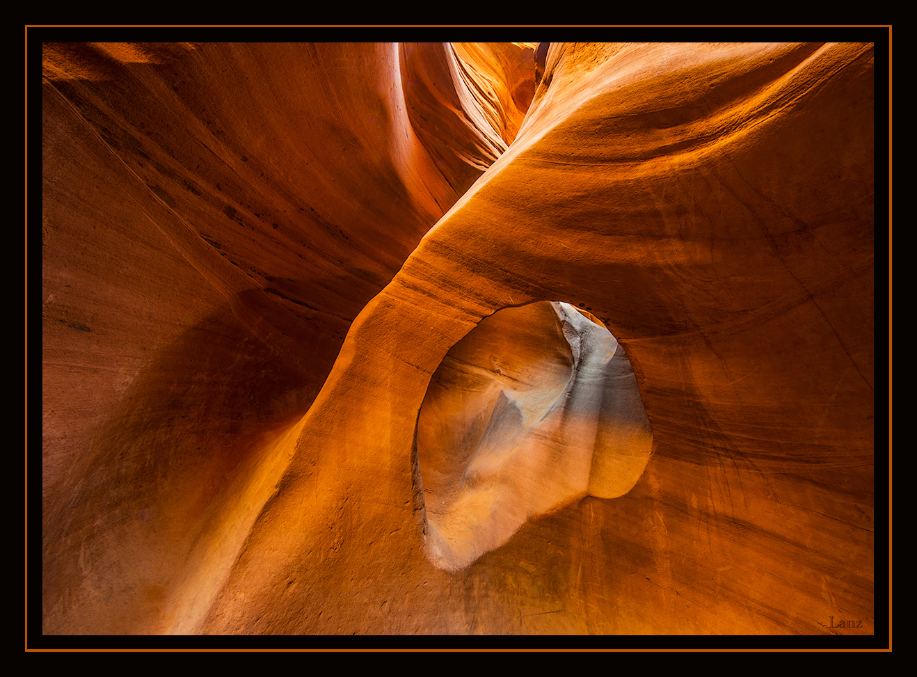
Thank you for your comments on the previous version of this image. Here it is shot in horizontal. I thought people may want to see this wider view, and I am interested in knowing which orientation is preferred, if either. The way through this beautiful slot canyon is up the ledge on the left and then thru the narrow opening behind the hole in the stone. It is so narrow from here that I had to remove my camera bag to squeeze through in places. D600, 14-24 f2.8 @ 20, f20,  2.0 sec., iso 200, slight crop off the right. Suggestions and other comments (including orientation preference, if any) welcome. 

Comments

11 comments
Comment posted by Ed Lowe on June 29, 2017 at 9:06 AM
Another beauty, Scott. Hard to chose which one I like better and that is a good thing. The lighting is gorgeous and the colors look very natural to me. I also enjoyed reading how you got to this particular spot. Great work.

Ed
Registered on February 7, 2004, 414 Posts, 7115 Comments
Comment posted by Craig Moreau on June 29, 2017 at 9:12 AM
Scott, my first impression was that I preferred the previous view, but as I look at this one more, I'm not so sure. I'm glad you posted a wider view. In this one, I like that the swirling striations of the rock oppose the strong diagonal of the arch top, and how the lines all lead in from the corners. The only thing that distracts a bit is the brighter rock in the ULC. Maybe that could be burned down a bit. Whatever the image preference may be, you have two great views of this slot canyon to enjoy.
Registered on April 21, 2015, 64 Posts, 584 Comments
Comment posted by Mark Seaver on June 29, 2017 at 11:04 AM
A fun and interesting comparison, Scott.  For me, the choice is easy, the vertical view is notably stronger because of how it emphasizes the narrow ridge and the light coming in at the top.
Registered on January 23, 2011, 1103 Posts, 17270 Comments
Comment posted by Harry Lichtman on June 29, 2017 at 12:25 PM
I prefer the vertical version, seems to work better with the sweep of the arch. Also makes the arch more prominent in the image.  Would be interesting to see a shot with a hiker passing behind the arch too.  The arch is highlighted perfectly.
Registered on September 17, 2010, 304 Posts, 3507 Comments
Comment posted by Paul Breitkreuz on June 29, 2017 at 5:13 PM
Scott, another very fine image. Not sure a slot canyon can have a bad photo.....sad
I will say that I typically like horizontal orientation over vertical, but years ago having a discussion with a long time previous NPN member we decided most homes seem to hold more vertical scenes hanging on the walls then horizontal. So, there must be something said for that POV and draw towards that view.....laugh

EDIT: looking back just now at the vertical view the immediate placement of the diagonal points of the arch from URHC to LLHC seems to hold a certain impact on the scene over the horizontal view.....enlightened
Registered on February 25, 2006, 525 Posts, 8448 Comments
Comment posted by Aaron Feinberg on June 29, 2017 at 6:48 PM
Loved hiking this canyon.  So much fun.  Nice shot here. 

aF
Registered on October 26, 2009, 399 Posts, 2789 Comments
Comment posted by Aaron Feinberg on June 29, 2017 at 6:49 PM
re; horiz vs vert.   Most art that is sold is horizontal.
Registered on October 26, 2009, 399 Posts, 2789 Comments
Comment posted by Igor Hoveijn on June 30, 2017 at 4:03 PM
For me the strength of the image is the X shape and that is more prominent in the portrait version. But in this version the large curves of the layers are more emphasized and I like how they emanate from the ULC. So I only have a slight preference for the portrait version. In both light, colours and detail are just great.
Registered on November 2, 2015, 18 Posts, 192 Comments
Comment posted by gary phillips on June 30, 2017 at 9:05 PM
While both are very nice, I think I like the horizontal.   I think that the flow of canyon shows better with more room.  The upper left corner sorta draws the eye and I think you could crop some from the top without changing the quality of the image.  Really well done.
Registered on October 24, 2013, 185 Posts, 4136 Comments
Comment posted by Alberto Patiño on July 1, 2017 at 12:45 PM
Scott, I much prefer this version, but then I have a strong preference for horizontal compositions. Both are equally excellent in terms of tonality and color, but to me this composition is much stronger.
Registered on December 2, 2014, 278 Posts, 1736 Comments
Comment posted by Brian Schrayer on July 2, 2017 at 4:58 PM
I like your composition here, Scott, especially the way that the lines form an X with the "portal" forming an O near the center.  This does feel a bit one dimensional, though.  I think deepining the shadows a bit more would help add a sense of dimension to this. 
Registered on May 28, 2004, 114 Posts, 2890 Comments