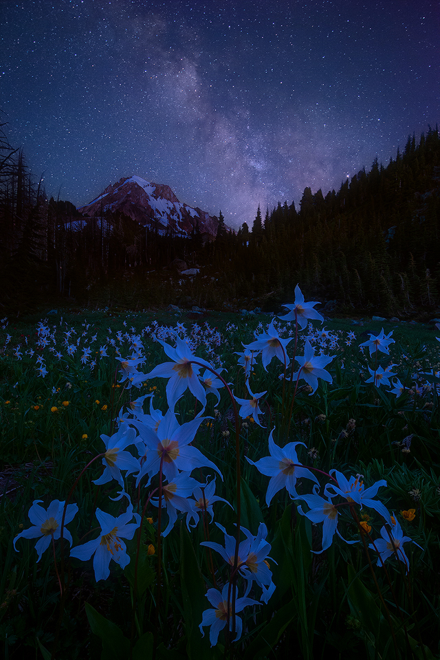
This image was taken the night prior to
my last post, and is a blend created in the same way. The first image was taken at 7:37 p.m., and the final at 9:35 p.m. As with the prior image, I find these darkness of night shots to have a much narrower viewing range; I recommend viewing the larger image (click on the smaller version above) in a dark environment on a calibrated monitor if possible.

Comments
19 comments--P
Nick Bristol
Lone Rock, WI.
This is fantastic. Kudos to you in visualizing and crafting this alpine night time landscape. Just beautiful.
Who am I to make a critique when I have no experience on these type images, nor any info on the flowers themselves, but I'll pose this anyway. Are the original, daytime flower pedals white? I get the color temp will change a LOT during the late times in which you're photographing, but I just want to think that these should be more white? Not pure mind you, far from it, I get the hour and color temp... but again, I don't know the flower so I could be way off base.
I hope my line of questioning makes sense. And regardless, I love the image and kudos for pulling this off. I think you've nailed the exposure and luminosity between the two combined scenes.
Lon
https://en.wikipedia.org/wiki/Erythronium_montanum
And yes perhaps they are a bit too blue. Although the color seems more 'right' when the overall exposure is lower such as in the large version. I actually like the lighter version overall, except that the flowers are unnaturally blue in that version.
In the original processing I wanted to keep a bit of blue in the image to give the feeling of night; in this version the flowers lose that and look dull IMHO. (Once again, it's best to click on the image to view it on a darker background.)
Having some time to go back and review the original though, I agree it is too much. The eye acclimates so much during processing; I find it easy to not notice color shifts that an eye sees after viewing neutral. (This effect is much stronger with a bright background, such as NPN's default white with the smaller version, than it is with a dark background. Since I process on dark, it's a bit harder to pick up.)
Thanks for taking the time to rework and repost this image after feedback. Completely agree, your intermediate repost goes back too far to neutral and doesn't look natural. I agree that a nighttime image should have blue in it and understand you wanting to retain it. I think your last repost is spot on! It's completely natural - at least to my eye what I would envision the color temp to be had I been there experiencing the scene. The repost is leaning white, but has just the right amount of coolness and luminosity. Awesome!
Lon
Ed
--P