Nature Photographers Network
This is the preserved archive of the original Nature Photographers Network. The community continues at naturephotographers.network.
Yellowstone Falls
‹ PreviousLandscape GalleryNext ›

Yellowstone Falls

by Allen Brooks

Gallery: LandscapePosted October 24, 2017120 views5 comments
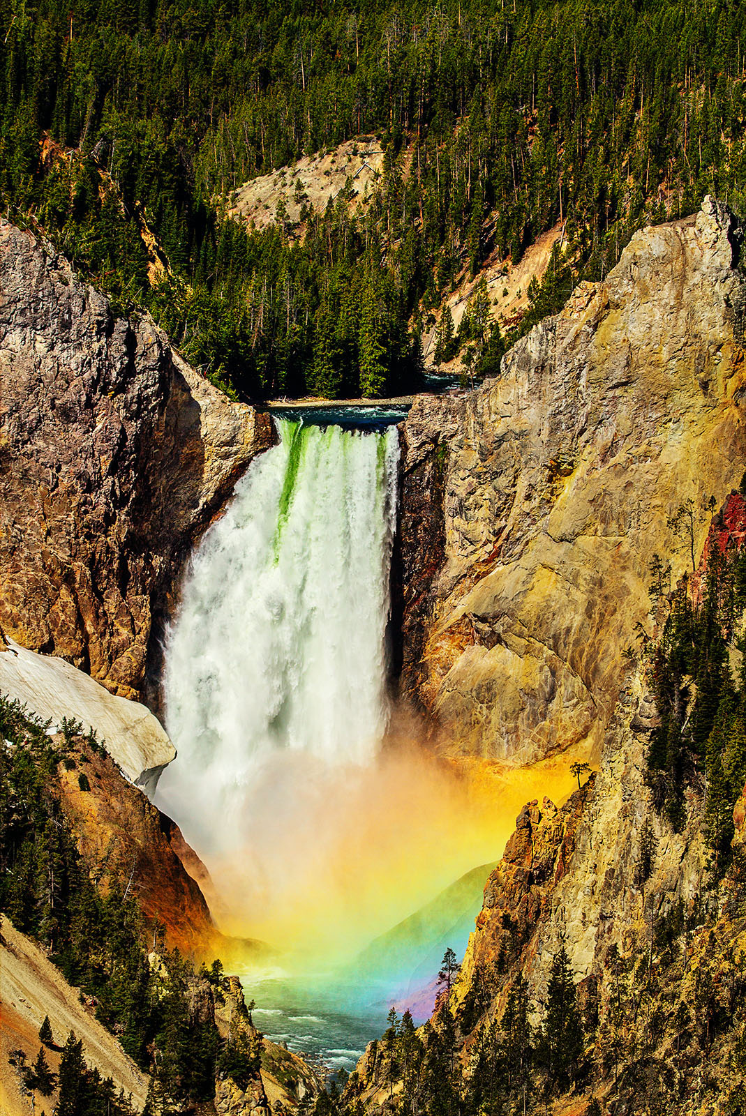
I waited a good hour for the sun to be in the right position for the rainbow to appear, but it was worth the wait.  I worked in PS to bring out the colors of the rainbow.  Hope it's not too over the top, but the photo was taken, after all, at Artist's Point.

Canon 7d
Canon 100-400 at 135 mm
1/400 at f 11
ISO 100
Tripod

Thanks for looking, comments and suggestions are appreciated.

Comments

5 comments
Comment posted by Lon Overacker on October 24, 2017 at 12:55 PM
Allen,

Classic Yellowstone; much like Tunnel View in Yosemite or the Snake River overlook, Oxbox bend in the Tetons, these places are special for a reason.  Kudos for sticking out long enough to reach the peak of the moment.

I really like the accentuated rainbow and colors there in.  However, it looks like the saturation was applied globally.  Personally, I would paint/mask the other areas such as the green at the top of the falls; the yellow/red going up the right side wall, and then the left wall is a little magenta.  I think if you toned the saturation down in those areas while leaving the rainbow spray, you'll have a winner from this spot.

Lon
Registered on November 24, 2006, 521 Posts, 19147 Comments
Comment posted by John Williams on October 24, 2017 at 1:32 PM
I'm curious Allen, how long did the rainbow last? Is it a quick thing, or does it hang around for awhile?

Lon's correct, I'd lower the saturation slightly overall, and then even more in the non-rainbow areas. The rainbow will look even better when contrasted with the subdued colors in the rest of the image.
Registered on September 6, 2007, 221 Posts, 5985 Comments
Comment posted by Harley Goldman on October 24, 2017 at 4:29 PM
I would agree with Lon's assessment. With a bit more work, you will have a real nice image. 
Registered on November 19, 2003, 586 Posts, 11271 Comments
Comment posted by Igor Doncov on October 24, 2017 at 6:16 PM
I agree with Lon's recommendations (except the magenta). The bottom 1/4-1/3 of the image would make a great image.
Registered on November 22, 2014, 189 Posts, 2733 Comments
Comment posted by Mark Seaver on October 26, 2017 at 2:27 PM
Allen, this is a fine look at this classic YNP view, with the rainbow in the mist.  I've tried several times, but not had the patience to wait.  While I think this is somewhat over saturated, I'm especially enjoying the touch of purple in the rainbow.
Registered on January 23, 2011, 1103 Posts, 17270 Comments