Gallery: LandscapePosted August 13, 20073,125 views38 comments
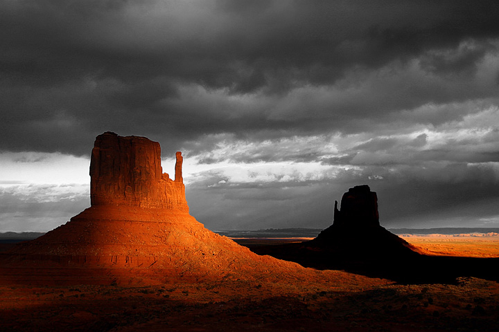
Got some nice light, punched it up with some dodging for drama.
Comments
38 comments
Comment posted by Adam Kavalunas on August 13, 2007 at 11:46 PM
The sky seems a bit B&W compared to the awesome color in the foreground. I might try to bring some cool tones into the sky and at the same time maybe bring up a little detail
in the shadows.
Registered on June 22, 2006, 73 Posts, 464 Comments
Comment posted by Jimmy Gekas on August 13, 2007 at 11:50 PM
I like the light and shadow on the left. The really dark shadows on the other mitten may look better with a little more detail, like the shadow detail on the left of the image. The bw sky is bothersome to me and, as Adam points out, needs some cool color tones.
Registered on July 26, 2007, 244 Posts, 2807 Comments
Comment posted by Ashutosh Rajekar on August 14, 2007 at 12:20 AM
The sky looks rather out of place but this has all it takes to be a really powerfull photograph. Get the color back in the sky and you have a winner of an oft-photographed place.
Registered on June 8, 2006, 51 Posts, 910 Comments
Comment posted by Kartik Venkatarama on August 14, 2007 at 12:43 AM
Well, here's the original. I'm not a fan of the sky in the original .jpeg image, so decided to make the image more abstract with the b/w sky. As for detail in the shadow of the right mitten, there's not much to be extracted from the .jpg file of a canon digital rebel - this is an almost 4 year old image, one of my first with a DSLR - I did not even know what RAW was back then :-).
Registered on July 27, 2007, 197 Posts, 830 Comments
Comment posted by Mike Dawson on August 14, 2007 at 12:45 AM
I like version 2 better, this definitely has some drama
Registered on February 4, 2006, 364 Posts, 8872 Comments
Comment posted by Brian Rasmussen on August 14, 2007 at 1:24 AM
The little bit of detail in the black really makes a difference... the second version is really nice imo. The front 'monument' appears to be lit with a giant flashlight!
Registered on July 26, 2005, 121 Posts, 1884 Comments
Comment posted by Leann Greene on August 14, 2007 at 1:29 AM
The 2nd is just wonderful.
Registered on January 25, 2006, 223 Posts, 3566 Comments
Comment posted by Jimmy Gekas on August 14, 2007 at 2:24 AM
There ya go...the second image is way better with the color in the sky and just a hint of detail in the dark shadow.
Registered on July 26, 2007, 244 Posts, 2807 Comments
Comment posted by Richard Wong on August 14, 2007 at 2:48 AM
While the 1st photo looks very graphical and cool in it's own right, I'm partial to the more realistic colored sky in the 2nd. Nice light.
Registered on February 2, 2006, 79 Posts, 2629 Comments
Comment posted by Kah Kit Yoong on August 14, 2007 at 3:59 AM
Much prefer the 2nd version. I would try to bring out more blue & red in the second version to contrast with each other.
Registered on September 27, 2006, 636 Posts, 10682 Comments
Comment posted by Mark Pelton on August 14, 2007 at 6:30 AM
I'll have to be contrarian and go with the first image. Yea, the sky is not realistic, but it is much more dramatic IMO. The silhouette of the 2nd mitten with no detail, also has more impact IMO. I agree with your instincts in version 1.
Registered on November 25, 2003, 380 Posts, 4647 Comments
Comment posted by Mia McPherson on August 14, 2007 at 6:49 AM
I prefer the second version.
The mittens have such drama with this light, well done!
Registered on June 25, 2007, 491 Posts, 12566 Comments
Comment posted by John Mumaw on August 14, 2007 at 7:27 AM
Right place and right time.
I love the lighting contrasts you were able to capture!
Makes for a very unique view of an oft photographed scene.
Registered on September 9, 2005, 62 Posts, 2289 Comments
Comment posted by Adrian Klein on August 14, 2007 at 9:09 AM
Great timing being there and very nice capture. I like the 2nd personally, since I am not a big fan of mixing b&w and color for my landscapes.
Registered on June 10, 2007, 112 Posts, 1506 Comments
Comment posted by Jody Grigg on August 14, 2007 at 9:23 AM
#1 is very cool, #2 gets the vote!
Registered on February 7, 2004, 165 Posts, 1227 Comments
Comment posted by Dan Baumbach on August 14, 2007 at 9:55 AM
I love the color of the mittens against the gray sky. Well done.
- Dan.
Registered on November 1, 2003, 473 Posts, 7980 Comments
Comment posted by Guy Tal on August 14, 2007 at 10:41 AM
The light here is just amazing. I love the soft transitions and the mix of bright/dark areas. One of the best I've seen from this place!
Guy
Registered on November 1, 2003, 566 Posts, 15507 Comments
Comment posted by Arnab Banerjee on August 14, 2007 at 11:11 AM
Never seen this kind of light on this landscape (which is probably photogrpahed miilions of times) - good catch
Registered on January 3, 2007, 313 Posts, 2270 Comments
Comment posted by Giovanni Russello on August 14, 2007 at 11:29 AM
The first offres a very original and drammatic landscape.
Well done and composed.
gio
Registered on January 21, 2007, 95 Posts, 1617 Comments
Comment posted by Ryan Shain on August 14, 2007 at 11:49 AM
Love the light and drama you captured Kartik,
Beautifully composed, captured, and processesd. I think I prefer the original, number two. The sky looks more natural with the scene.
Beautiful work
Registered on February 20, 2007, 226 Posts, 4571 Comments
Comment posted by Scott Fricke on August 14, 2007 at 2:45 PM
I like the graphic nature of the first post, but like the second one much better.
Registered on January 19, 2007, 133 Posts, 1448 Comments
Comment posted by Joshua Hardin on August 14, 2007 at 5:00 PM
My vote is for #2 as well, the sky is interestingly colorful. Although, I do like how you burned the second mitten in the background in #1.
Registered on July 29, 2006, 40 Posts, 414 Comments
Comment posted by Eric Hahl on August 14, 2007 at 5:04 PM
I don't know. I like the colored sky and all but the artful take on the first image really works for me. It's quite dramatic and punchy.
Registered on November 23, 2003, 33 Posts, 107 Comments
Comment posted by Rick Lundh on August 14, 2007 at 5:07 PM
Awesome job on the dramatic portrayal!
Registered on April 28, 2004, 774 Posts, 4351 Comments
Comment posted by Ian Cameron on August 14, 2007 at 5:13 PM
Stunning shot with fabulous colur and a dark brooding sky to die for. Particularly effective with one partially lit mitten and the other almost silhouetted. In all honesty I am more taken with the original presentation. The sky is distinctly Scottish looking and makes the colour pop.
Registered on August 6, 2004, 1125 Posts, 3318 Comments
Comment posted by Todd Caudle on August 14, 2007 at 5:23 PM
I agree about the sky looking b&w. If that was intentional, perhaps this should be posted in photo art. Regardless, this is one of the neatest Mitten Buttes shots I've ever seen.
Oops! Just scrolled down and saw the repost. Don't know why you're not a fan of the clouds in color, I think they're awesome. Maybe darken them a little bit to match the mood of your original post. Devastatingly beautiful!
Registered on November 9, 2003, 472 Posts, 3705 Comments
Comment posted by Eric Good on August 14, 2007 at 8:54 PM
I think if you darken and some contrast to that colored sky, you'll have the best of both worlds. That would be one dramatic image. Fantastic capture.
Registered on March 17, 2007, 116 Posts, 4764 Comments
Comment posted by Mike Veltri on August 14, 2007 at 9:59 PM
Very dramatic image, I like it. I would pick the second.
Registered on February 3, 2007, 51 Posts, 1077 Comments
Comment posted by Dietrich Gloger on August 16, 2007 at 12:54 PM
The light is absolutely amazing. Also that sky looks great - it only looks a bit to grey. Great photo anyway.
Registered on January 26, 2007, 360 Posts, 9876 Comments
Comment posted by Derrald Farnsworth on August 28, 2007 at 9:14 AM
Very dramatic. I like both versions and depending on my mood I would choose a different one every time.
Registered on August 27, 2007, 56 Posts, 548 Comments
Comment posted by Lon Overacker on August 28, 2007 at 9:14 PM
Kartik,
Incredible light. I love the contrast between the mitten in the golden light against the mirrored one in shadow. this is excellent. I love the b&w treatment of the sky - nice mixture between the color and b&w.
Lon
Registered on November 24, 2006, 521 Posts, 19147 Comments
Comment posted by Vincent FAVRE on March 3, 2008 at 4:11 AM
I love it ;)
Registered on September 2, 2007, 37 Posts, 213 Comments
Comment posted by RobK on April 10, 2008 at 10:41 PM
I like the first one , well done !!!!
Registered on February 6, 2008, 20 Posts, 101 Comments
Comment posted by Kevin Pieper on April 10, 2008 at 11:10 PM
Very dramatic light. I like #2 better.
Registered on February 20, 2006, 47 Posts, 134 Comments
Comment posted by Andrey Antov on May 4, 2008 at 10:51 AM
Dramatic!
Andrey
Registered on March 18, 2008, 292 Posts, 341 Comments
Comment posted by Prashant Khapane on September 23, 2008 at 1:14 PM
like this one. I actually like the first one, may be something between the two would be great.
Registered on November 1, 2003, 492 Posts, 4580 Comments
Comment posted by Rick Gomez on November 11, 2008 at 8:00 PM
WOW!
Registered on March 3, 2007, 206 Posts, 1853 Comments
Comment posted by Mark Seawell on July 7, 2012 at 6:53 AM
Wow. I love this capture. Spotted light, dark foreground but the suns pops through to touch the land. Gorgeous capture.
Mark
Registered on December 5, 2011, 197 Posts, 237 Comments

Comments
38 commentsin the shadows.
The mittens have such drama with this light, well done!
I love the lighting contrasts you were able to capture!
Makes for a very unique view of an oft photographed scene.
- Dan.
Guy
Well done and composed.
gio
Beautifully composed, captured, and processesd. I think I prefer the original, number two. The sky looks more natural with the scene.
Beautiful work
Oops! Just scrolled down and saw the repost. Don't know why you're not a fan of the clouds in color, I think they're awesome. Maybe darken them a little bit to match the mood of your original post. Devastatingly beautiful!
Incredible light. I love the contrast between the mitten in the golden light against the mirrored one in shadow. this is excellent. I love the b&w treatment of the sky - nice mixture between the color and b&w.
Lon
Andrey
Mark